10 Best Product Analytics Dashboards of 2026

10 Best Product Analytics Dashboard Shortlist


With so many different analytics solutions available, figuring out which one is right for you is tough. You know you want to present complex product data in a clear and accessible manner, allowing teams to quickly understand how customers use your products and make informed decisions but need to figure out which tool is best. I've got you! In this post I'll help make your choice easy, sharing my personal experiences using dozens of different tools with large teams and diverse products, with my picks of the best product analytics dashboards.
Why Trust Our Software Reviews
We’ve been testing and reviewing product management software since 2020. As product managers ourselves, we know how critical and difficult it is to make the right decision when selecting software.
We invest in deep research to help our audience make better software purchasing decisions. We’ve tested more than 2,000 tools for different product management use cases and written over 1,000 comprehensive software reviews. Learn how we stay transparent & our software review methodology.
Best Product Analytics Dashboard Summary
This comparison chart summarizes pricing details for my top product analytics dashboard selections to help you find the best one for your budget and business needs.
| Tool | Best For | Trial Info | Price | ||
|---|---|---|---|---|---|
| 1 | Best for real-time collaboration and visualization of product analytics data | Free plan available | From $8/member/month (billed annually) | Website | |
| 2 | Product analytics dashboard for automatic friction scores | Free plan available | From $25/month (billed annually) | Website | |
| 3 | Product analytics dashboard with predictive analytics | Free plan available | Pricing upon request | Website | |
| 4 | Product analytics dashboard with a session replay feature | Free demo available | Pricing upon request | Website | |
| 5 | Product analytics dashboard with custom real-time alerts feature | Free plan + free demo available | From $1200/year (billed annually) | Website | |
| 6 | Product analytics dashboard with a click heatmap feature | Free plan available | Pricing upon request | Website | |
| 7 | Product analytics tool with a resource wiki builder | 30-day free trial + free plan + free demo available | Pricing upon request | Website | |
| 8 | Best for embedded interactive visualizations | Free plan available | From $22/user/month (billed annually) | Website | |
| 9 | Product analytics dashboard for improving product adoption | Free plan + free trial + free demo available | Pricing upon request | Website | |
| 10 | Best for AI-powered, conversational data analysis | Free demo available | Pricing upon request | Website |

Best Product Analytics Dashboard Reviews
Below are my detailed summaries of the best product analytics dashboard that made it onto my shortlist. My reviews offer a detailed look at the key features, pros & cons, integrations, and ideal use cases of each tool to help you find the best one for you.
Miro
Best for real-time collaboration and visualization of product analytics data

Miro is an online whiteboard platform that supports teamwork in brainstorming, planning, and designing by keeping everyone on the same page.
Miro distinguishes itself with an infinite canvas for extensive project mapping and an integrated video chat for direct communication. The platform also accommodates diverse idea expressions, including numerical, image-based, or video formats, and offers tools for quickly adapting diagrams and charts. TalkTrack recordings additionally allow for asynchronous process explanations, enhancing collaboration. Miro integrates smoothly with major workplace tools like Notion, Confluence, Asana, and Monday.com, making it a practical choice for product analytics dashboards.
The software also integrates with other workplace tools like Zoom, Microsoft Teams, Slack, Google Workspace, Asana, monday.com, Jira, Dropbox, OneDrive, Notion, Airtable, ClickUp, and Unito, among others.
A free plan is available and paid plans start from $10 per user per month.
New Product Updates from Miro

Miro Adds Copilot and GitHub AI Agent Integrations
Miro has introduced Miro Agent for Microsoft Copilot, Work IQ support, and Miro Agent App for GitHub. These integrations help teams connect AI tools with Miro boards and visual collaboration workflows. For more information, visit Miro’s official site.

Mouseflow is a comprehensive user behavior analytics tool designed to help businesses understand how visitors interact with their websites and web-based apps. By offering a suite of features like session recordings, heatmaps, funnel analytics, and form analysis, Mouseflow provides a holistic view of user engagement.
As a product analytics dashboard, Mouseflow excels with its detailed and actionable data. The session recording tool allows businesses to watch real user sessions and understand their journey, while the heatmap tool visually represents user interactions, highlighting areas of interest and neglect. The form analysis feature identifies where users encounter issues in form completion, and the funnel analytics tool helps track and optimize user conversion paths. Mouseflow's friction score feature further quantifies user difficulties, providing a clear metric to guide improvements.
Integrations include Omniconvert, Adobe Target, AB Tasty, Convert Experiences, BigCommerce, WooCommerce, Shopify, Intercom, HubSpot, Google Analytics, Google Tag Manager, Zendesk, WordPress, Wix, Kissmetrics, and others.
A free plan and a 14-day free trial are available.
Product analytics dashboard with predictive analytics

Google Analytics is a product analytics dashboard for understanding how people use your app or website. You can use it to find insights about user demographic trends or changes in customer behavior. It has a reporting feature for the real-time monitoring of activities on your site or app.
Google Analytics is the best product analytics dashboard if you want to know how customers will act in the future because of its predictive capabilities. You can use Google Analytics to determine which customers are in danger of churning or who might be susceptible to an upsell. The tool lets you group information according to users, purchasing actions, and/or app usage and build marketing plans around that data.
Google Analytics integrates with other Google solutions like Google Ads, Google Cloud, Google Play, and Google Ad Manager.
Google Analytics has a free version and they offer a paid version with tiered pricing that’s available upon request.
Product analytics dashboard with a session replay feature

Quantum Metric is a product analytics tool for improving products by gathering data from customers’ behavior in-app. It has alerts that notifies you of critical customer actions, like delay or frustration using a specific feature. Quantum Metric offers page analytics for isolating detractors and promoters and the features that drive them.
Quantum Metric is the best product analytics dashboard with a session replay feature for recreating how customers use your site or app. This feature allows you to see the challenges or errors customers encounter so you can improve underperforming pages.
You can use Quantum Metric to capture specific timeframes and share them with team members. Session replays also capture the metadata behind the replay, like user platform or network details and other factors that may have affected customer experience.
Quantum Metric pricing and a free demo are available upon request.
Mixpanel
Product analytics dashboard with custom real-time alerts feature

Mixpanel is a business analytics platform for tracking user interactions to improve engagement and retention. It has an insight reporting feature to see popular features and how they affect customer conversion. You can connect Mixpanel to a data source or data warehouse to analyze business intelligence from various sources. It has interactive dashboards your team can use to monitor metrics and key performance indicators.
You can use Mixpanel to uncover the paths that loyal users take to improve conversion rates. The feature also lets you identify high-performing segments and the features customers find attractive. The tool identifies the features customers use that resulted in churn so your product team can improve them.
Mixpanel also lets you re-engage potential churn customers to convert them with improved features.You can integrate Mixpanel with a data warehouse or product analytics tools like Google Cloud, AB Tasty, Amazon Web Services, and Apptimize.
Mixpanel has a free plan with limited features for up to 100,000 monthly tracked users. Pricing for the paid plans starts at $20/month/account.

UXCam is a product analytics dashboard for mobile applications. It has a screen flow feature to see how customers engage with your mobile app and identify drop-off points that could be better optimized. UXCam uses machine learning to analyze the user experience and automatically uncover issues your product team might have missed.
UXCam is the best product analytics dashboard for identifying features or layouts that cause customer frustration with the help of its heatmaps. This helps identify customer behavior within the app to pinpoint design elements you can improve upon. Click heatmaps also enable you to identify features that customers frequently use and use them as selling points to attract new users.You can connect your EXCam to a paid Zapier account to access premium apps and tools.
UXCam has a free version with limited features for up to 10,000 sessions per month.
Pricing details for paid plans are available upon request. They offer a 14-day free trial for paid plans.

Pendo is a product adoption platform used by companies like Cisco, Marketo, Zendesk, ADP, and OpenTable, to name a few. It lets you create tooltips or walkthroughs to promote seldom-used but valuable features. You can also use Pendo to set retention goals, track active accounts, watch adoption trends, and report on user behavior.
Pendo is the best product analytics dashboard if you want to address product analytics data with in-app wikis, resources, and self-help modules. Pendo helps you identify customer needs and pain points and then gives you space to build out comprehensive walkthroughs to guide customers through these areas with ease.
Pendo integrates with other product analytics tools like G2 Reviews, Twilio Segment, and Fullstory.
Pendo has a free version with limited features for up to 1,000 active monthly users, and they provide pricing information for paid plans and a free demo upon request.

Observable is a web-based platform that enables you to create interactive data visualizations and dashboards using code. It supports various programming languages, allowing for flexible and dynamic data exploration. Designed for collaboration, Observable brings together developers, data scientists, and analysts to work on data projects.
Its embedded analytics feature lets you and your team create interactive visualizations that can be shared and embedded directly into your applications or websites. What makes this handy is the real-time interactivity it brings to your data presentations, allowing users to engage with the data dynamically, which can lead to better insights and decision-making. Another notable feature is the rapid prototyping capabilities through live JavaScript notebooks. These notebooks let you quickly test and visualize your data analytics ideas without the need for complex setup or deployment processes. You can build and iterate on your dashboards using various programming languages supported by the platform.
Integrations include AWS, Azure, GCP, GitHub, GitLab, Jenkins, Host monitoring, and Kubernetes.
Observable offers a free plan as well as paid plans with access to free trials and demos.

Heap is a digital insights platform to monitor what is happening in your product, app, or website and how these events affect your revenues. It has interactive dashboards to keep all team members aligned toward achieving the same core metrics and goals. This product analytics tool has a built-in performance monitoring feature to alert you upon detecting fluctuations in KPIs.
Heap is the best product analytics dashboard if you want to identify behaviors that signify long-term value and improve product adoption. Heap can help you isolate and eliminate features that prevent users from adopting your product. You can then use this product analytics software to create a roadmap for customers with product adoption and activation in mind.
Heap integrates with other tools, including Marketo, Intercom, Optimize, and Salesforce.
Heap is a free product analytics tool for up to 10,000 sessions and one project per month.
For paid plans, they offer pricing details upon request, as well as a 14-day free trial or free demo.
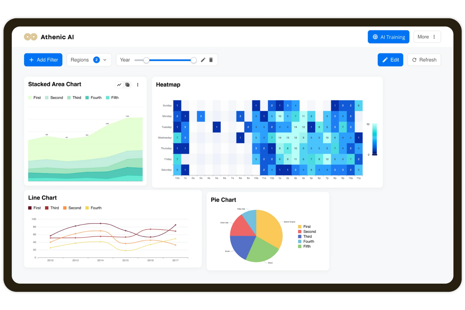
Athenic is an AI-powered product analytics dashboard that helps you explore, visualize, and understand complex data through natural, conversational interactions. It enables teams to create customizable dashboards, track performance, and uncover trends without requiring technical expertise.
I picked Athenic for its conversational analytics capability, which allows you to ask questions in natural language and receive instant, AI-powered insights. This makes it particularly helpful when you need quick answers without digging through raw data. Athenic also supports custom AI models tailored to your business needs, ensuring the insights you get are relevant and actionable. Additionally, its automated reporting and email updates make it easier to keep your team informed in real time.
Athenic offers dynamic dashboards with customizable visualizations, AI-powered data exploration, and automated reporting to streamline decision-making. Its knowledge graph feature enhances query accuracy, while follow-up question support allows you to dig deeper into insights without rerunning analyses. Integrations with tools like Notion, Stripe, Asana, Google Calendar, and CRMs provide broader context for data analysis.
Integrations are available with Notion, Stripe, Asana, Google Calendar, SQL databases, CRMs, and ERPs.
Other Product Analytics Dashboards
Here are some additional product analytics dashboard options that didn’t make it onto my shortlist, but are still worth checking out:
- LogRocket
Product analytics dashboard with revenue and funnel insights
- InnerTrends
Product analytics dashboard with cohort analysis feature
- Creabl
Product analytics dashboard for the entire customer journey
- Amplitude
Product analytics dashboard for measuring customer engagement
- Zoho Analytics
Product analytics dashboard with an AI assistant feature
- Similarweb
Web analytics SaaS for understanding your competitor’s web traffic and performance.
- Hotjar
Product experience tool to discover user needs using heatmaps.
- Tableau
Visual analytics platform for analyzing business intelligence.
- Dragonboat
Product portfolio management software for strategizing, prioritizing, delivering, and improving products
- Matomo
Web analytics software for generating reports on your website and its users.


How I Evaluate Product Analytics Dashboards
When product managers need to track activation funnels or share retention dashboards with stakeholders, I evaluate tools on two levels: what they must have, and what truly differentiates them.
Core Functionality (Table Stakes For This List)
When I'm selecting tools for my list, I rank each one on a scale from 0 (does not offer the functionality) to 5 (excels in this area) for each core functionality listed below. Then, I calculate the tool's total score into a percentage. Each tool needs to achieve a minimum total score of 65% to be considered for inclusion.
- Event Tracking & Data Capture: I check whether a tool captures custom events and user interactions via SDK, auto-capture, or server-side ingestion across web and mobile.
- Prebuilt & Custom Dashboards: A strong template library matters, but I also look for drag-and-drop builders that let PMs create views for specific launches or OKRs.
- Funnel & Retention Analysis: Tools should surface multi-step funnels and cohort retention grids inside dashboards, not just as separate, siloed reports.
- User Segmentation: I evaluate whether you can slice dashboard data by behavioral cohorts, user properties, or account attributes and reuse those segments.
- Real-Time Data Visualization: Dashboards need near real-time refresh and a solid chart library so a PM can monitor a release day without waiting on batch updates.
- Sharing & Collaboration: Teams present insights to engineering, marketing, and leadership constantly, so I look for shareable links, scheduled reports, and Slack delivery.
Once I have a list of tools that meet this criteria, I consider what sets each platform apart.
Differentiating Factors (What Sets Vendors Apart)
Here's how I compare and contrast different vendors:
Standout Features
Session replay is a major differentiator. It lets you jump from a metric like a drop-off spike straight into a user recording to see what went wrong. Feature flag integration matters just as much. I evaluate whether a tool ties dashboard data to A/B tests so you can measure a release's impact without switching platforms. For teams with mature data stacks, warehouse-native architecture is also worth considering—running queries on your own Snowflake or BigQuery instance avoids duplicate data pipelines.
Beyond Features
Pricing models vary widely in this space. I check whether a vendor charges by tracked events, monthly users, or seats, since a tool that looks affordable at low volume can become a budget problem as your product scales. Cross-functional accessibility also carries a lot of weight—product managers shouldn't need SQL to build a dashboard, and stakeholders in CS or marketing should be able to explore shared workspaces on their own. For teams in regulated industries, I evaluate data governance controls like SOC 2 compliance, PII masking, and regional data residency options.
How to Choose Product Analytics Dashboard
It’s easy to get bogged down in long feature lists and complex pricing structures. To help you stay focused as you work through your unique software selection process, here’s a checklist of factors to keep in mind:
| Factor | What to Consider |
|---|---|
| Scalability | Can the tool grow with your business? Check if it handles increased data volumes and user counts without performance issues. Consider future growth plans. |
| Integrations | Does it integrate with your existing tools? Ensure it connects smoothly with your CRM, marketing platforms, and other essential apps. |
| Customizability | Can you tailor it to fit your workflows? Look for customization options that let you adapt dashboards and reports to your team's needs. |
| Ease of use | Is the interface intuitive? Evaluate if team members can quickly learn and use it. A complex tool may hinder adoption. |
| Implementation and onboarding | How long does setup take? Assess the resources needed for onboarding and whether support is available to guide you through the process. |
| Cost | Does it fit your budget? Compare pricing plans and look for hidden fees. Consider the value provided for the price. |
| Security safeguards | Are your data protected? Check for compliance with security standards and data encryption to ensure sensitive information is safe. |
| Support availability | Is help available when needed? Look for 24/7 support options and evaluate the responsiveness and helpfulness of the support team. |
What Are Product Analytics Dashboards?
Product analytics dashboards are tools that show you how people use your product, breaking down their actions into easy-to-read charts and graphs. Product managers, UX designers, and marketers use these dashboards to spot trends, find out where users get stuck, and make better decisions about what to improve next. You can see things like where people click, which features get the most love, and when users drop off—so you know exactly where to focus to make your product better.
Features
When selecting product analytics dashboard, keep an eye out for the following key features:
- Session replay: Allows you to watch recorded user sessions to understand user journeys and identify friction points.
- Heatmaps: Visualizes user interactions on your product, highlighting areas of interest and neglect.
- Funnel analytics: Tracks user conversion paths to pinpoint where users drop off in the process.
- Customizable dashboards: Lets you tailor the dashboard to focus on metrics and KPIs that matter most to your team.
- Real-time alerts: Provides instant notifications about significant changes in user behavior or KPIs.
- User segmentation: Analyzes user behavior based on specific criteria, enabling targeted insights.
- Integrations: Connects seamlessly with other essential tools and platforms your team uses.
- Predictive analytics: Uses data to forecast future trends and user behavior, aiding in proactive decision-making.
- Data security: Ensures that sensitive user data is protected and complies with industry standards.
- Interactive product tours: Offers guided walkthroughs to help users quickly understand and use the tool effectively.
Benefits
Implementing product analytics dashboard provides several benefits for your team and your business. Here are a few you can look forward to:
- Improved decision-making: Access to detailed data and insights helps your team make informed product choices.
- Enhanced user experience: Features like session replays and heatmaps identify user pain points, allowing for targeted improvements.
- Increased conversions: Funnel analytics pinpoint where users drop off, enabling optimization of conversion paths.
- Efficient resource allocation: Customizable dashboards focus on key metrics, helping prioritize team efforts and resources.
- Proactive problem-solving: Real-time alerts and predictive analytics allow you to address issues before they impact users.
- Better user engagement: User segmentation provides insights into different user groups, allowing for tailored engagement strategies.
Costs & Pricing
Selecting product analytics dashboard requires an understanding of the various pricing models and plans available. Costs vary based on features, team size, add-ons, and more. The table below summarizes common plans, their average prices, and typical features included in product analytics dashboard solutions:
Plan Comparison Table for Product Analytics Dashboard
| Plan Type | Average Price | Common Features |
|---|---|---|
| Free Plan | $0 | Basic analytics, limited data storage, and essential support. |
| Personal Plan | $10-$30/user/month | Advanced analytics, custom dashboards, and email support. |
| Business Plan | $40-$80/user/month | Team collaboration tools, API access, and priority support. |
| Enterprise Plan | $100-$200/user/month | Custom integrations, dedicated account management, and enterprise-level security features. |
Product Analytics Dashboard FAQs
Here are some answers to common questions about product analytics dashboard:
How do I ensure data security with a product analytics dashboard?
To ensure data security with a product analytics dashboard, verify that the platform complies with industry standards. Look for features like data encryption, access controls, and regular security audits. Ask the vendor about their data protection policies and whether they provide compliance support for regulations like GDPR or CCPA. It’s crucial to choose a dashboard that prioritizes data security to protect sensitive user information and maintain trust with your customers.
Is training required to use a product analytics dashboard effectively?
Yes, some training may be required to use a product analytics dashboard effectively. While many platforms offer intuitive interfaces, understanding the full capabilities may take time. Look for vendors that provide training resources like webinars, tutorials, and user guides. These resources can help your team quickly get up to speed and make the most of the tool’s features. Investing in training can lead to more accurate data interpretation and better decision-making.
How can I measure the impact of a new feature using a product analytics dashboard?
You can set up event tracking for the feature in your dashboard and create conversion or funnel reports to see how many users actually adopt it. Compare behavior before and after rollout across segments (e.g., plan types, regions) to detect changes in use or drop-off. Use this insight to decide whether the feature is worth scaling or needs iteration.
What are typical drop-off points I should monitor on a product analytics dashboard?
Common drop-off points include the onboarding flow, trial-to-paid conversion, new user activation, and feature discovery journeys. Your dashboard should surface where users leave the flow, how long they take to perform key steps, and which steps cause friction. That helps you prioritise fixes rather than guessing where issues may lie.
How do I align dashboard metrics with business outcomes rather than just usage stats?
Go beyond surface KPIs like daily active users by defining metrics that connect to business value—such as time-to-value (how fast users realise benefit), retention rate of high-value users, or upgrade conversion rate. Link those in your dashboard so you trace how user actions map to revenue, churn, or expansion. That alignment makes your analytics more actionable.
What should I keep in mind when sharing product analytics dashboards across multiple teams?
Ensure your dashboard is understandable by non-technical stakeholders: include clear labels, avoid jargon, and tailor views for roles (e.g., product-ops vs execs). Set alert thresholds so teams get notified when metrics deviate. Also ensure access controls are set correctly so people see only relevant data and your teams stay aligned on terminology and definitions.
What’s Next:
If you're in the process of researching product analytics dashboard, connect with a SoftwareSelect advisor for free recommendations.
You fill out a form and have a quick chat where they get into the specifics of your needs. Then you'll get a shortlist of software to review. They'll even support you through the entire buying process, including price negotiations.