10 Best Visual Reporting Tools for Analysts in 2026

10 Visual Reporting Tools Shortlist


With so many different visual reporting solutions available, figuring out which is right for you is tough. You know you want to translate complex data sets into clear, visually engaging presentations that allow you to extract user insights in an instant but need to figure out which tool is best for the job. I've got you! In this post I'll help make your choice easy, sharing my personal experiences using dozens of different tools with large teams and diverse projects, with my picks of the best visual reporting tools.
Why Trust Our Software Reviews
We’ve been testing and reviewing product management software since 2020. As product managers ourselves, we know how critical and difficult it is to make the right decision when selecting software.
We invest in deep research to help our audience make better software purchasing decisions. We’ve tested more than 2,000 tools for different product management use cases and written over 1,000 comprehensive software reviews. Learn how we stay transparent & our software review methodology.
Best Visual Reporting Tools Summary
This comparison chart summarizes pricing details for my top visual reporting tools selections to help you find the best one for your budget and business needs.
| Tool | Best For | Trial Info | Price | ||
|---|---|---|---|---|---|
| 1 | Segment comprehensive business intelligence data according to any criteria | 15-day free trial + free plan + free demo available | From $24/month (billed annually) | Website | |
| 2 | Best for frictionless data sharing with teams | Free plan available | From $29/month | Website | |
| 3 | Use dashboards to build a narrative around your data | Free trial + free plan available | From $15/user/month (billed annually) | Website | |
| 4 | Improve your marketing efforts with data analytics | Free demo available | From $200/month (billed annually) | Website | |
| 5 | Start analyzing your marketing performance with adaptable templates | Free demo available | Pricing upon request | Website | |
| 6 | Organize your data with AI-powered suggestions | Free demo available | Pricing upon request | Website | |
| 7 | Manipulate and combine data with a non-code BI reporting tool | Free demo available | Pricing upon request | Website | |
| 8 | Simplify your marketing reports | 14-day free trial + free demo available | From $62/month (billed annually) | Website | |
| 9 | Best for instant AI-powered data insights | Free demo available | Pricing upon request | Website | |
| 10 | Find inspiration for your reports from a community of five million data lovers | 30 days free trial | From $12/user/month | Website |
Best Visual Reporting Tool Reviews
Below are my detailed summaries of the best visual reporting tools that made it onto my shortlist. My reviews offer a detailed look at the key features, pros & cons, integrations, and ideal use cases of each tool to help you find the best one for you.
Segment comprehensive business intelligence data according to any criteria

Zoho Analytics is a cloud-based business intelligence platform with an emphasis on visual reporting. It helps product managers answer key questions about their products by using interactive dashboards and reports that make exploring data easy. Users can connect to databases, spreadsheets, cloud applications, and even social media sources to pull in the data they need for analysis. The platform then serves as a hub for organizing and displaying this information visually appealingly. It offers several interactive visualization options that simplify comparing results side by side. This helps product managers get an accurate picture of how different factors impact their products without having to wade through complex spreadsheets or guess what might be causing certain outcomes.
One of the unique features of Zoho Analytics is its ability to drill down into data sets easily. Users can group or segment their data according to any criteria they choose. Zoho allows users to create visual reports in minutes using drag-and-drop tools. These reports are then customizable, allowing users to customize colors, fonts, and sizes. Users can also set up automated email notifications for when certain criteria are met, or certain actions take place. Zoho also allows users to perform sophisticated analyses of their product data. This includes analyzing sales trends over time and segmenting customers by location or other demographic information. This allows businesses to gain insight into customer behavior and identify areas where they could be improving or needing improvement.
Integrations include Microsoft Office 365, Microsoft Teams, Google Drive, Zendesk, and ServiceNow. Integrations via Zapier and Zoho Flow are also supported. Being part of the Zoho ecosystem allows you to connect to several of Zoho’s own services for Sales, Marketing, CRM, customer service, and more.
Zoho Analytics costs from $24/month and offers a 15-day free trial.
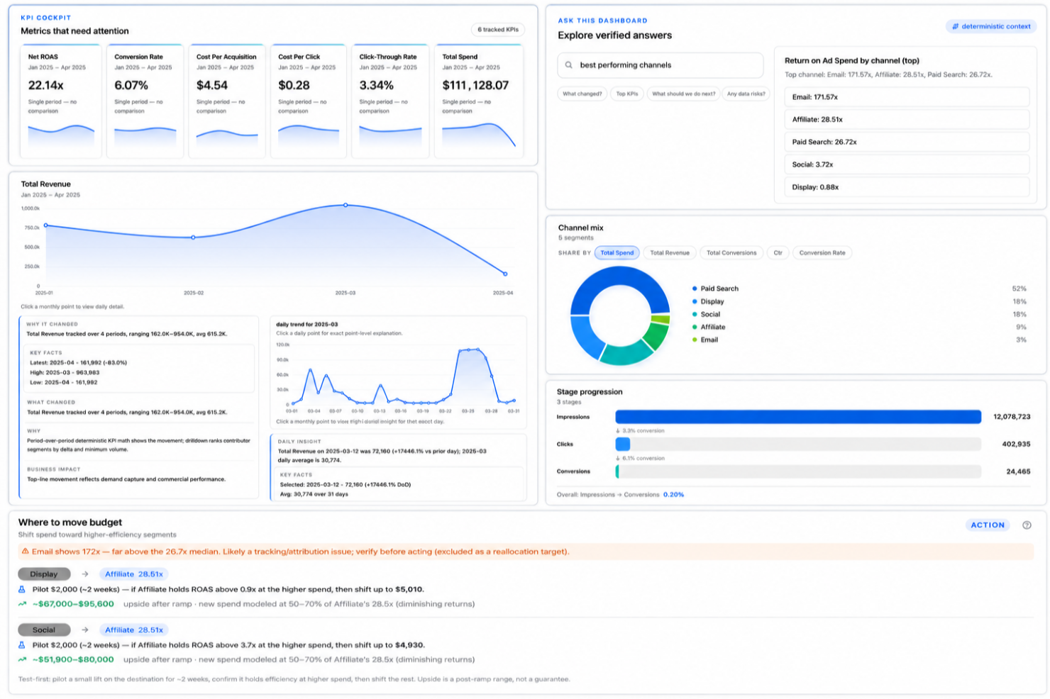
Signara is an AI-powered visual reporting platform that auto-generates interactive dashboards, KPI metrics, data narratives, insights, and recommendations directly from connected business data sources like HubSpot, Snowflake, and Google Sheets.
Who Is Signara Best For?
Signara is a good fit for data and analytics teams at mid-sized businesses that need automated reporting without relying on a dedicated BI developer.
Why I Picked Signara
I've included Signara in my top picks because of how it handles report distribution across a team. On the Business plan, reports and interactive dashboards draw from a shared pool, meaning every team member works from the same output rather than separate, potentially inconsistent versions. I also like the shareable report URL format (like getsignara.com/report), which lets you send a live, interactive report to a stakeholder without them needing a login. Pair that with the PPTX and Meeting Brief export, and getting polished visuals in front of the right people takes almost no effort.
Signara Key Features
- AI-generated narratives: Signara automatically writes plain-language explanations of your data trends alongside every visual report.
- Driver analysis: Signara visually surfaces which factors caused a KPI to move, breaking down the contribution of each variable.
- Ask-the-dashboard analytics: Users can ask questions about dashboard data in natural language and receive answers without building custom reports.
- Multi-source data connectors: Connect to sources like Snowflake, BigQuery, HubSpot, PostgreSQL, and Google Sheets to pull data directly into your reports.
Signara Integrations
Signara connects to data sources including Snowflake, Databricks, BigQuery, PostgreSQL, MySQL, Google Sheets, and HubSpot, and supports drag-and-drop file uploads for Excel, CSV, TSV, and JSON.
Pros and Cons
Pros:
- Every metric is auditable and traceable
- Reports generate from raw data instantly
- AI narratives explain KPI changes automatically
Cons:
- No API available for custom workflows
- Setup requires high data cleanliness

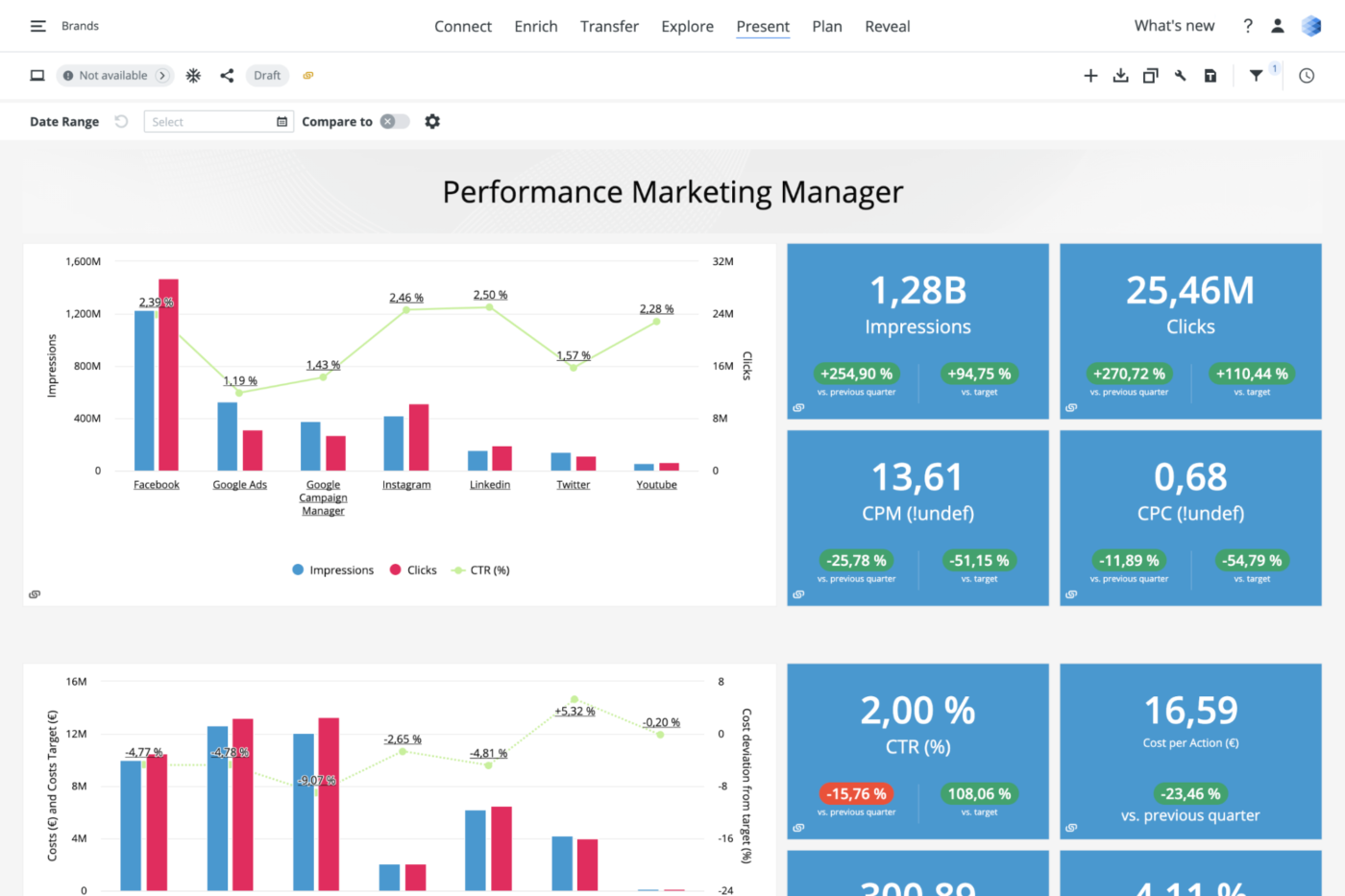
Tableau is a business intelligence and data analysis solution. The tool helps you collect data from multiple sources and create collective datasets you can share with coworkers in real-time.
One of the good things about this platform is that it enables you to create a narrative around your data analysis. You can map out each data source and create custom dashboards and reports to make the information accessible for people who don’t deal with data on a regular basis.
Tableau’s data prediction tools help you plan future projects with accuracy, and its community of users share great templates and offer suggestions.
Tableau costs from $70/user/month. You can access a 14-day free trial.

Funnel is a marketing data platform that enables you to track your marketing performance across multiple tools. The platform helps you extract metrics from multiple sources across dozens of marketing campaigns, and makes it easy to create comprehensive dashboards that track KPIs and calculate your return on advertising spend (ROAS).
This visual reporting solution pulls data from over 500 tools, including Google Analytics, Google Data Studio, Google Ad, Google Search Console, Moz Pro or any other SEO tool, and social media ad platforms, and combines it into a neat marketing report that shows you everything you need to know about your marketing campaigns.
Funnel has a vast learning center that helps you understand how to perform product analysis and turn the existing information into business intelligence reports. The solution has a bit of a learning curve, but once you get used to it, it can help you improve your marketing efforts.
Funnel costs from $399/5 users/month. You can book a free demo.
Adverity
Start analyzing your marketing performance with adaptable templates
Adverity is an end-to-end marketing analytics solution that helps marketing teams improve their performance with data-based decision-making. The platform extracts data from multiple sources and consolidates it into clean reports, making it easy for marketing teams to identify growth opportunities.
This solution gives you the flexibility to choose between a no-code or a low-code approach to data manipulation, and you can leverage its automation features to standardize your data strategy across multiple projects.
The platform offers multiple templates for data interpretation, and you can tailor each template to your company’s needs.
Adverity costs from $2000/business. The company offers a free version with limited functionalities.
New Product Updates from Adverity
Adverity Enhances Connectors and Adds TikTok GMV Max
Adverity updates connectors for Amazon Ads, SmartNews Ads, Indeed, and monday.com, and introduces the TikTok GMV Max connector. These updates improve data accuracy, control, and performance across integrations. For more information, visit Adverity’s official site.
 .
.
SAP Analytics Cloud is a platform that allows you to discover, visualize and leverage data for improved business intelligence (BI). This reporting tool impresses with its predictive analytics and analytics designer features, which allow you to create complex analytical applications.
One of the tool’s notable features is its ability to simulate any scenario and create plans from predictions. This helps you use more data in your decision-making process, making it easier to address your company’s needs. SAP Analytics Cloud comes with built-in templates you can use to organize data in real-time.
The platform’s dashboard suggestions are great, and they help you make sense of big data. SAP Analytics Cloud offers costs from $36/user/month. You can also request a 90-day free trial through their website.

Grow is one of the few no-code BI reporting tools that help you dive deep into data without SQL or software engineers. The platform pulls data from multiple sources, such as CRMs, spreadsheets, ad platforms, social media, and other tools, and helps you create easy-to-understand reports.
The highlight of this solution is that it allows you to see multiple dashboards in one place. This helps you make a visual comparison of various metrics, so you can improve your decision-making process.
Grow’s training library helps you understand how to manipulate data and combine multiple datasets to identify patterns. You can slice, filter, and use different visualizations to gain helpful insights for your business.
Grow offers custom pricing upon request. You can request a free trial.

Swydo is a data reporting and monitoring platform that helps marketing teams create professional-looking reports. The solution enables digital marketing experts to combine data extracted from multiple sources into a single report, helping them uncover insights about their campaigns.
One of the good things about this tool is that it comes with customizable widgets. This allows marketing teams to create templates they can use across multiple clients and reports.
The platform’s marketing dashboards look great and they make the information easy to understand, so marketers can use them to present their results to clients or decision-makers.
Swydo costs from $39/month. You can access a free 14-day trial.

Athenic is an AI-powered business intelligence and data analytics platform designed to make visual reporting fast and accessible. It enables product managers and business teams to analyze data through customizable dashboards, interactive reports, and advanced visualization tools without requiring technical expertise. With support for natural language queries, you can ask questions in plain English and receive instant insights presented as tables, charts, or graphs.
I picked Athenic as a top visual reporting tool because of its ability to deliver instant, AI-powered insights while keeping reporting simple and intuitive. Its conversational interface lets you interact with your data naturally, making it ideal for non-technical users who want answers quickly. Additionally, its Knowledge Graph feature allows you to explore relationships between datasets and uncover deeper patterns, enabling both quick overviews and comprehensive analysis.
Athenic’s flexibility in customization also stood out. You can adapt AI models to suit your specific business needs, ensuring reports remain highly relevant while saving time during the reporting process.
Athenic offers advanced visualization capabilities, including heatmaps, box plots, and customizable dashboards that make interpreting data straightforward. Its Agentic Deep Research automates complex analysis, helping you generate in-depth reports efficiently. The platform’s AI Trust Framework supports reliable data exploration, giving you confidence in the insights you’re reviewing.
Integrations include Google Sheets, Facebook, Telegram, Slack, Notion, Stripe, AWeber, Asana, Zoho CRM, Google Calendar, Smartlead, and Google Analytics.
Observable
Find inspiration for your reports from a community of five million data lovers

Observable is a cloud-based data visualization platform where your team can explore, analyze, and learn with data. Thanks to its versatility, this reporting tool is a great choice for developers, engineers, and generally anyone who enjoys coding their own way of interpreting data.
One of the great things about this platform is that it allows you to collaborate and communicate with data. You can start building reports and dashboards using predesigned templates and code snippets, but you can also reuse examples created by a community of over five million data enthusiasts.
Observable pulls data from the world’s most popular databases, including Google BigQuery, Snowflake, Excel, or Sheets. Users can export their visualizations to external reporting tools and apps, making it easy to present their findings to decision-makers.
Observable costs from $12/user/month. The platform offers a free 30-day trial. You can also access a free-forever version with limited capabilities.
Other Visual Reporting Tools
Here are some additional visual reporting tools options that didn’t make it onto my shortlist, but are still worth checking out:
- dReveal
Collect and organize data for your internal audits
- monday AI Work Platform
Keep track of product data and KPIs with colorful dashboards
- Smartsheet
Collaborate on reports in real-time
- Wrike
Visual reporting to schedule report delivery to email accounts
- Jama Software
For customizable dashboards
- Sisense
AI-driven solution that enables you to uncover insights from datasets.
- Toucan
Visual reporting tool that removes the complexity from data reporting.
- Visplore
Data reporting solution that helps users break down and interpret big data.
- Analogyx BI
Real-time analytics tool helps users process and interpret data.
- Dundas
Data analysis software that helps organizations make data-driven decisions.


How I Evaluate Visual Reporting Tools
I split my evaluation into baseline criteria—can a PM connect Jira, build a KPI dashboard, and share it with leadership?—and differentiators that separate good tools from great ones.
Core Functionality (Table Stakes For This List)
When I'm selecting tools for my list, I rank each one on a scale from 0 (does not offer the functionality) to 5 (excels in this area) for each core functionality listed below. Then, I calculate the tool's total score into a percentage. Each tool needs to achieve a minimum total score of 65% to be considered for inclusion.
- Visual Dashboard Builder: I evaluate chart variety and layout flexibility—can a PM build a feature adoption funnel, a sprint velocity chart, and a revenue dashboard without workarounds?
- Data Source Integrations: The tool should connect natively to PM staples like Jira, Amplitude, Mixpanel, or Google Analytics, plus support databases and spreadsheet imports.
- Roadmap & Timeline Visualization: I look for Gantt views, swimlane layouts, or now/next/later boards that let product teams map releases and dependencies visually.
- Interactive Reports & Filtering: Static charts aren't enough. I check whether stakeholders can drill down by cohort, date range, or feature to answer their own follow-up questions.
- Sharing & Collaboration: Product reports reach a wide audience. I evaluate options like shareable links, scheduled email digests, Slack delivery, and embeds into tools like Confluence or Notion.
- Real-Time Data Refresh: Dashboards lose trust when data is stale. I look at refresh frequency across connected sources—hourly at minimum, with near real-time options preferred.
Once I have a list of tools that meet this criteria, I consider what sets each platform apart.
Differentiating Factors (What Sets Vendors Apart)
Here's how I compare and contrast different vendors:
Standout Features
AI-powered insights can save hours of manual analysis. I look for tools that flag anomalies like a sudden drop in feature adoption or a spike in churn without prompting. Pre-built PM templates also matter because they cut setup time; a good template library includes OKR trackers, launch dashboards, and sprint reports ready to populate. I also evaluate whether a tool supports storyboard-style reports, which let PMs walk executives through a narrative rather than dumping a wall of charts.
Beyond Features
Pricing structure matters a lot for product teams. I check whether a tool offers free viewer seats so execs and cross-functional partners can access dashboards without inflating costs. Time-to-value is another big factor—can a PM connect Jira and publish a live dashboard in under an hour without filing a ticket with engineering? I also evaluate integration depth, specifically whether connectors to tools like Amplitude, Productboard, or BigQuery support bi-directional sync rather than one-way imports that go stale.
How to Choose Visual Reporting Tools
It’s easy to get bogged down in long feature lists and complex pricing structures. To help you stay focused as you work through your unique software selection process, here’s a checklist of factors to keep in mind:
| Factor | What to Consider |
|---|---|
| Scalability | Can the tool grow with your business? Consider if it can handle increasing data volumes and users without performance issues. |
| Integrations | Does it connect with your existing systems? Evaluate compatibility with your current data sources and software. |
| Customizability | Can you tailor it to fit your needs? Look for options to customize dashboards and reports to match your workflows. |
| Ease of use | Is it intuitive for your team? Ensure the tool is user-friendly and doesn't require extensive training to get started. |
| Implementation and onboarding | How quickly can you implement it? Consider the time and resources required to onboard your team and integrate with your systems. |
| Cost | Does it fit your budget? Review the pricing structure, including any hidden fees, and compare it with the features offered. |
| Security safeguards | Are your data protected? Check for encryption standards, access controls, and compliance with data protection regulations. |
| Support availability | Is help readily available? Ensure the vendor offers adequate support channels, such as chat, email, or phone, and check their response times. |
What Are Visual Reporting Tools?
Visual Reporting Tools are software that help you turn raw data into easy-to-read charts, graphs, and dashboards. Analysts, managers, and team leads use these tools to spot trends, track progress, and share insights with others. They make it easier for you to understand complex information and communicate results quickly.
Features
When selecting visual reporting tools, keep an eye out for the following key features:
- Customizable dashboards: Allow you to tailor visualizations to suit your specific business needs and workflows.
- Real-time data updates: Ensure that the information you analyze and report on is always current and accurate.
- Data integration: Connects seamlessly with various data sources to provide a comprehensive view of your analytics.
- Interactive visualizations: Enable users to engage with data through dynamic charts and graphs for deeper insights.
- Predictive analytics: Uses historical data to forecast future trends, helping you make informed business decisions.
- User-friendly interface: Makes it easy for team members of all skill levels to navigate and use the tool effectively.
- Collaboration features: Allow teams to share insights and work together on data-driven projects efficiently.
- Security safeguards: Protect sensitive data with encryption and access controls to ensure compliance with regulations.
- Training and support resources: Provide users with the necessary tools and guidance to maximize the software's potential.
- Scalability: Supports growing data volumes and user numbers, ensuring long-term usability as your business expands.
Benefits
Implementing visual reporting tools provides several benefits for your team and your business. Here are a few you can look forward to:
- Improved decision-making: Real-time data updates and predictive analytics help you make informed choices based on the latest information.
- Enhanced collaboration: Collaboration features allow team members to share insights and work together effectively on data-driven projects.
- Increased efficiency: Customizable dashboards and user-friendly interfaces make it easier to visualize and analyze data quickly.
- Better data insights: Interactive visualizations and data integration provide a clear and comprehensive view of your business metrics.
- Scalability: The ability to handle growing data volumes and users ensures the tools remain useful as your business expands.
- Data security: Security safeguards protect sensitive information, ensuring compliance with data protection regulations.
- Accessible training resources: Training and support resources empower your team to fully utilize the software’s capabilities.
Costs & Pricing
Selecting visual reporting tools requires an understanding of the various pricing models and plans available. Costs vary based on features, team size, add-ons, and more. The table below summarizes common plans, their average prices, and typical features included in visual reporting tools solutions:
Plan Comparison Table for Visual Reporting Tools
| Plan Type | Average Price | Common Features |
|---|---|---|
| Free Plan | $0 | Basic visualizations, limited data sources, and community support. |
| Personal Plan | $5-$25/user/month | Customizable dashboards, multiple data integrations, and email support. |
| Business Plan | $30-$60/user/month | Advanced analytics, real-time updates, collaboration tools, and phone support. |
| Enterprise Plan | $75-$150/user/month | Full data integration, predictive analytics, dedicated support, and security enhancements. |
Visual Reporting Tools FAQs
Here are some answers to common questions about visual reporting tools:
Do visual reporting tools require technical expertise?
No, most visual reporting tools are designed to be user-friendly and don’t require extensive technical skills. They often feature drag-and-drop interfaces and intuitive design. However, some advanced features may need a bit of training or support. It’s helpful to explore training resources provided by the vendor to get started.
How do you maintain accuracy and consistency in reports over time?
Accuracy comes from using verified data sources and applying consistent rules when building reports. Establish a review schedule to catch discrepancies early. Your team should agree on data definitions so everyone interprets results the same way.
What are the common pitfalls when deploying visual reporting tools across teams?
Teams often face challenges like duplicate reports, inconsistent formats, or dashboards that aren’t used regularly. These issues usually come from unclear roles or a lack of shared standards. Setting clear processes for report creation and review helps maintain alignment.
How do you ensure dashboards stay relevant to business goals?
Dashboards need regular reviews to stay aligned with your team’s objectives. If goals or metrics change, update the visuals and data sources to match. Encourage feedback from key users so reports continue to support everyday decision-making.
How can teams promote adoption of visual reporting tools among employees?
Encourage employees to use the tool by showing how it fits into their daily routines. Offer short, hands-on sessions to help them feel comfortable using it. When teams see how it simplifies their work, they’re more likely to rely on it consistently.
What’s Next:
If you're in the process of researching visual reporting tools, connect with a SoftwareSelect advisor for free recommendations.
You fill out a form and have a quick chat where they get into the specifics of your needs. Then you'll get a shortlist of software to review. They'll even support you through the entire buying process, including price negotiations.