10 Migliori Strumenti di Reportistica Visiva per Analisti nel 2026

10 Elenco Selezionato di Strumenti di Reporting Visivo


Con così tante soluzioni di reporting visivo disponibili, capire quale sia quella giusta per te può essere difficile. Sai di voler tradurre insiemi di dati complessi in presentazioni chiare e visivamente coinvolgenti che ti permettano di estrarre informazioni sugli utenti in un attimo, ma devi capire quale strumento sia il migliore per il compito. Ci penso io! In questo articolo ti aiuterò a rendere la tua scelta facile, condividendo le mie esperienze personali con decine di strumenti diversi utilizzati in grandi team e su progetti vari, con le mie scelte tra i migliori strumenti di reporting visivo.
Why Trust Our Software Reviews
We’ve been testing and reviewing product management software since 2020. As product managers ourselves, we know how critical and difficult it is to make the right decision when selecting software.
We invest in deep research to help our audience make better software purchasing decisions. We’ve tested more than 2,000 tools for different product management use cases and written over 1,000 comprehensive software reviews. Learn how we stay transparent & our software review methodology.
Riepilogo dei Migliori Strumenti di Reporting Visivo
Questa tabella comparativa riassume i dettagli sui prezzi delle mie scelte principali di strumenti di reporting visivo per aiutarti a trovare quello più adatto al tuo budget e alle esigenze della tua azienda.
| Tool | Best For | Trial Info | Price | ||
|---|---|---|---|---|---|
| 1 | Segment comprehensive business intelligence data according to any criteria | 15-day free trial + free plan + free demo available | From $24/month (billed annually) | Website | |
| 2 | Best for frictionless data sharing with teams | Free plan available | From $29/month | Website | |
| 3 | Use dashboards to build a narrative around your data | Free plan available | From $15/user/month (billed annually) | Website | |
| 4 | Improve your marketing efforts with data analytics | Free demo available | From $200/month (billed annually) | Website | |
| 5 | Start analyzing your marketing performance with adaptable templates | Free demo available | Pricing upon request | Website | |
| 6 | Organize your data with AI-powered suggestions | Free demo available | Pricing upon request | Website | |
| 7 | Manipulate and combine data with a non-code BI reporting tool | Free demo available | Pricing upon request | Website | |
| 8 | Simplify your marketing reports | 14-day free trial + free demo available | From $62/month (billed annually) | Website | |
| 9 | Best for instant AI-powered data insights | Free demo available | Pricing upon request | Website | |
| 10 | Find inspiration for your reports from a community of five million data lovers | 30 days free trial | From $12/user/month | Website |
Recensioni dei Migliori Strumenti di Reporting Visivo
Di seguito trovi le mie sintesi dettagliate dei migliori strumenti di reporting visivo inclusi nella mia lista selezionata. Le mie recensioni offrono una panoramica approfondita delle caratteristiche principali, pro e contro, integrazioni e casi d’uso ideali di ciascuno strumento per aiutarti a trovare quello giusto per te.
Segment comprehensive business intelligence data according to any criteria

Zoho Analytics is a cloud-based business intelligence platform with an emphasis on visual reporting. It helps product managers answer key questions about their products by using interactive dashboards and reports that make exploring data easy. Users can connect to databases, spreadsheets, cloud applications, and even social media sources to pull in the data they need for analysis. The platform then serves as a hub for organizing and displaying this information visually appealingly. It offers several interactive visualization options that simplify comparing results side by side. This helps product managers get an accurate picture of how different factors impact their products without having to wade through complex spreadsheets or guess what might be causing certain outcomes.
One of the unique features of Zoho Analytics is its ability to drill down into data sets easily. Users can group or segment their data according to any criteria they choose. Zoho allows users to create visual reports in minutes using drag-and-drop tools. These reports are then customizable, allowing users to customize colors, fonts, and sizes. Users can also set up automated email notifications for when certain criteria are met, or certain actions take place. Zoho also allows users to perform sophisticated analyses of their product data. This includes analyzing sales trends over time and segmenting customers by location or other demographic information. This allows businesses to gain insight into customer behavior and identify areas where they could be improving or needing improvement.
Integrations include Microsoft Office 365, Microsoft Teams, Google Drive, Zendesk, and ServiceNow. Integrations via Zapier and Zoho Flow are also supported. Being part of the Zoho ecosystem allows you to connect to several of Zoho’s own services for Sales, Marketing, CRM, customer service, and more.
Zoho Analytics costs from $24/month and offers a 15-day free trial.
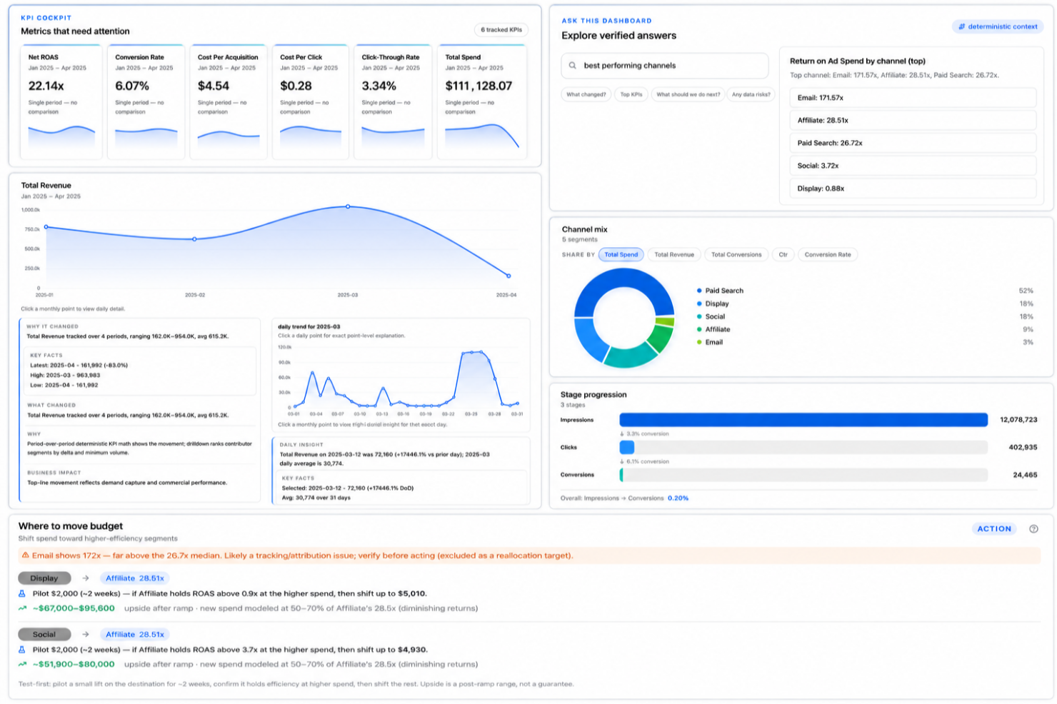
Signara is an AI-powered visual reporting platform that auto-generates interactive dashboards, KPI metrics, data narratives, insights, and recommendations directly from connected business data sources like HubSpot, Snowflake, and Google Sheets.
Who Is Signara Best For?
Signara is a good fit for data and analytics teams at mid-sized businesses that need automated reporting without relying on a dedicated BI developer.
Why I Picked Signara
I've included Signara in my top picks because of how it handles report distribution across a team. On the Business plan, reports and interactive dashboards draw from a shared pool, meaning every team member works from the same output rather than separate, potentially inconsistent versions. I also like the shareable report URL format (like getsignara.com/report), which lets you send a live, interactive report to a stakeholder without them needing a login. Pair that with the PPTX and Meeting Brief export, and getting polished visuals in front of the right people takes almost no effort.
Signara Key Features
- AI-generated narratives: Signara automatically writes plain-language explanations of your data trends alongside every visual report.
- Driver analysis: Signara visually surfaces which factors caused a KPI to move, breaking down the contribution of each variable.
- Ask-the-dashboard analytics: Users can ask questions about dashboard data in natural language and receive answers without building custom reports.
- Multi-source data connectors: Connect to sources like Snowflake, BigQuery, HubSpot, PostgreSQL, and Google Sheets to pull data directly into your reports.
Signara Integrations
Signara connects to data sources including Snowflake, Databricks, BigQuery, PostgreSQL, MySQL, Google Sheets, and HubSpot, and supports drag-and-drop file uploads for Excel, CSV, TSV, and JSON.
Pros and Cons
Pros:
- Every metric is auditable and traceable
- Reports generate from raw data instantly
- AI narratives explain KPI changes automatically
Cons:
- No API available for custom workflows
- Setup requires high data cleanliness

Tableau is a business intelligence and data analysis solution. The tool helps you collect data from multiple sources and create collective datasets you can share with coworkers in real-time.
One of the good things about this platform is that it enables you to create a narrative around your data analysis. You can map out each data source and create custom dashboards and reports to make the information accessible for people who don’t deal with data on a regular basis.
Tableau’s data prediction tools help you plan future projects with accuracy, and its community of users share great templates and offer suggestions.
Tableau costs from $70/user/month. You can access a 14-day free trial.

Funnel is a marketing data platform that enables you to track your marketing performance across multiple tools. The platform helps you extract metrics from multiple sources across dozens of marketing campaigns, and makes it easy to create comprehensive dashboards that track KPIs and calculate your return on advertising spend (ROAS).
This visual reporting solution pulls data from over 500 tools, including Google Analytics, Google Data Studio, Google Ad, Google Search Console, Moz Pro or any other SEO tool, and social media ad platforms, and combines it into a neat marketing report that shows you everything you need to know about your marketing campaigns.
Funnel has a vast learning center that helps you understand how to perform product analysis and turn the existing information into business intelligence reports. The solution has a bit of a learning curve, but once you get used to it, it can help you improve your marketing efforts.
Funnel costs from $399/5 users/month. You can book a free demo.
Adverity
Start analyzing your marketing performance with adaptable templates
Adverity is an end-to-end marketing analytics solution that helps marketing teams improve their performance with data-based decision-making. The platform extracts data from multiple sources and consolidates it into clean reports, making it easy for marketing teams to identify growth opportunities.
This solution gives you the flexibility to choose between a no-code or a low-code approach to data manipulation, and you can leverage its automation features to standardize your data strategy across multiple projects.
The platform offers multiple templates for data interpretation, and you can tailor each template to your company’s needs.
Adverity costs from $2000/business. The company offers a free version with limited functionalities.
New Product Updates from Adverity
Adverity Enhances Connectors and Adds TikTok GMV Max
Adverity updates connectors for Amazon Ads, SmartNews Ads, Indeed, and monday.com, and introduces the TikTok GMV Max connector. These updates improve data accuracy, control, and performance across integrations. For more information, visit Adverity’s official site.
 .
.
SAP Analytics Cloud is a platform that allows you to discover, visualize and leverage data for improved business intelligence (BI). This reporting tool impresses with its predictive analytics and analytics designer features, which allow you to create complex analytical applications.
One of the tool’s notable features is its ability to simulate any scenario and create plans from predictions. This helps you use more data in your decision-making process, making it easier to address your company’s needs. SAP Analytics Cloud comes with built-in templates you can use to organize data in real-time.
The platform’s dashboard suggestions are great, and they help you make sense of big data. SAP Analytics Cloud offers costs from $36/user/month. You can also request a 90-day free trial through their website.

Grow is one of the few no-code BI reporting tools that help you dive deep into data without SQL or software engineers. The platform pulls data from multiple sources, such as CRMs, spreadsheets, ad platforms, social media, and other tools, and helps you create easy-to-understand reports.
The highlight of this solution is that it allows you to see multiple dashboards in one place. This helps you make a visual comparison of various metrics, so you can improve your decision-making process.
Grow’s training library helps you understand how to manipulate data and combine multiple datasets to identify patterns. You can slice, filter, and use different visualizations to gain helpful insights for your business.
Grow offers custom pricing upon request. You can request a free trial.

Swydo is a data reporting and monitoring platform that helps marketing teams create professional-looking reports. The solution enables digital marketing experts to combine data extracted from multiple sources into a single report, helping them uncover insights about their campaigns.
One of the good things about this tool is that it comes with customizable widgets. This allows marketing teams to create templates they can use across multiple clients and reports.
The platform’s marketing dashboards look great and they make the information easy to understand, so marketers can use them to present their results to clients or decision-makers.
Swydo costs from $39/month. You can access a free 14-day trial.

Athenic is an AI-powered business intelligence and data analytics platform designed to make visual reporting fast and accessible. It enables product managers and business teams to analyze data through customizable dashboards, interactive reports, and advanced visualization tools without requiring technical expertise. With support for natural language queries, you can ask questions in plain English and receive instant insights presented as tables, charts, or graphs.
I picked Athenic as a top visual reporting tool because of its ability to deliver instant, AI-powered insights while keeping reporting simple and intuitive. Its conversational interface lets you interact with your data naturally, making it ideal for non-technical users who want answers quickly. Additionally, its Knowledge Graph feature allows you to explore relationships between datasets and uncover deeper patterns, enabling both quick overviews and comprehensive analysis.
Athenic’s flexibility in customization also stood out. You can adapt AI models to suit your specific business needs, ensuring reports remain highly relevant while saving time during the reporting process.
Athenic offers advanced visualization capabilities, including heatmaps, box plots, and customizable dashboards that make interpreting data straightforward. Its Agentic Deep Research automates complex analysis, helping you generate in-depth reports efficiently. The platform’s AI Trust Framework supports reliable data exploration, giving you confidence in the insights you’re reviewing.
Integrations include Google Sheets, Facebook, Telegram, Slack, Notion, Stripe, AWeber, Asana, Zoho CRM, Google Calendar, Smartlead, and Google Analytics.
Observable
Find inspiration for your reports from a community of five million data lovers

Observable is a cloud-based data visualization platform where your team can explore, analyze, and learn with data. Thanks to its versatility, this reporting tool is a great choice for developers, engineers, and generally anyone who enjoys coding their own way of interpreting data.
One of the great things about this platform is that it allows you to collaborate and communicate with data. You can start building reports and dashboards using predesigned templates and code snippets, but you can also reuse examples created by a community of over five million data enthusiasts.
Observable pulls data from the world’s most popular databases, including Google BigQuery, Snowflake, Excel, or Sheets. Users can export their visualizations to external reporting tools and apps, making it easy to present their findings to decision-makers.
Observable costs from $12/user/month. The platform offers a free 30-day trial. You can also access a free-forever version with limited capabilities.
Altri Strumenti di Reporting Visivo
Ecco alcune opzioni aggiuntive di strumenti di reporting visivo che non hanno trovato posto nella mia lista principale, ma che vale comunque la pena considerare:
- dReveal
Collect and organize data for your internal audits
- monday.com
Keep track of product data and KPIs with colorful dashboards
- Smartsheet
Collaborate on reports in real-time
- Wrike
Visual reporting to schedule report delivery to email accounts
- Jama Software
For customizable dashboards
- Sisense
AI-driven solution that enables you to uncover insights from datasets.
- Toucan
Visual reporting tool that removes the complexity from data reporting.
- Visplore
Data reporting solution that helps users break down and interpret big data.
- Analogyx BI
Real-time analytics tool helps users process and interpret data.
- Dundas
Data analysis software that helps organizations make data-driven decisions.


Criteri di Selezione degli Strumenti di Reporting Visivo
Nella selezione dei migliori strumenti di reporting visivo da includere in questa lista, ho preso in considerazione esigenze comuni degli acquirenti e problematiche come la chiarezza della visualizzazione dei dati e la facilità di integrazione con i sistemi esistenti. Ho anche seguito il seguente schema per mantenere la mia valutazione strutturata ed equa:
Funzionalità Principali (25% del punteggio totale)
Per essere inclusa in questa lista, ogni soluzione doveva soddisfare questi casi d’uso comuni:
- Creare dashboard visive
- Generare report dai dati
- Integrare con le fonti dati
- Fornire aggiornamenti dei dati in tempo reale
- Esportare report in vari formati
Altre Funzionalità Distintive (25% del punteggio totale)
Per affinare ulteriormente la selezione, ho anche cercato funzionalità uniche, come:
- Opzioni di visualizzazione personalizzate
- Capacità di analisi predittiva
- Accesso e reattività su dispositivi mobili
- Approfondimenti guidati dall’IA
- Supporto multilingue
Usabilità (10% del punteggio totale)
Per valutare l’usabilità di ciascun sistema, ho considerato i seguenti aspetti:
- Interfaccia utente intuitiva
- Percorsi di navigazione chiari
- Curva di apprendimento minima
- Impostazioni dell’interfaccia personalizzabili
- Funzionalità di accessibilità
Onboarding (10% del punteggio totale)
Per valutare l’esperienza di onboarding per ciascuna piattaforma, ho considerato i seguenti elementi:
- Disponibilità di video formativi
- Tour interattivi del prodotto
- Accesso a modelli predefiniti
- Webinar dal vivo e sessioni di domande e risposte
- Team di onboarding di supporto
Supporto clienti (10% del punteggio totale)
Per valutare i servizi di assistenza clienti di ciascun fornitore software, ho considerato i seguenti aspetti:
- Disponibilità di assistenza 24/7
- Molteplici canali di contatto
- Accesso a una knowledge base
- Tempi di risposta alle richieste
- Disponibilità di team di supporto dedicati
Rapporto qualità-prezzo (10% del punteggio totale)
Per valutare il rapporto qualità-prezzo di ciascuna piattaforma, ho preso in considerazione quanto segue:
- Strutture di prezzo competitive
- Piani di abbonamento flessibili
- Sconti per contratti a lungo termine
- Gamma di funzionalità in rapporto al costo
- Scalabilità senza costi nascosti
Recensioni dei clienti (10% del punteggio totale)
Per comprendere il livello generale di soddisfazione dei clienti, ho considerato i seguenti aspetti leggendo le loro recensioni:
- Valutazioni di soddisfazione degli utenti
- Riscontri sull’efficacia delle funzionalità
- Commenti sulla qualità del supporto
- Facilità d’implementazione
- Suggerimenti per miglioramenti futuri
Come scegliere gli strumenti di reportistica visiva
È facile perdersi tra lunghe liste di funzionalità e strutture di prezzo complesse. Per aiutarti a rimanere concentrato durante il tuo processo unico di selezione del software, ecco una checklist dei fattori da tenere a mente:
| Fattore | Cosa considerare |
|---|---|
| Scalabilità | Lo strumento può crescere insieme alla tua azienda? Considera se riesce a gestire volumi di dati e utenti crescenti senza perdere in prestazioni. |
| Integrazioni | Si collega ai sistemi già in uso? Valuta la compatibilità con le fonti di dati e i software che già utilizzi. |
| Personalizzazione | È possibile adattarlo alle tue esigenze? Cerca opzioni per personalizzare dashboard e report secondo i tuoi flussi di lavoro. |
| Semplicità d’uso | È intuitivo per il tuo team? Assicurati che sia facile da usare e non richieda una formazione estesa per iniziare. |
| Implementazione e onboarding | Quanto tempo serve per implementarlo? Valuta il tempo e le risorse necessari per formare il team e integrarlo nei tuoi sistemi. |
| Costo | Rientra nel tuo budget? Esamina la struttura dei prezzi, compresi eventuali costi nascosti, e confrontala con le funzionalità offerte. |
| Tutela della sicurezza | I tuoi dati sono protetti? Controlla la presenza di standard di crittografia, controlli d’accesso e conformità alle normative per la protezione dei dati. |
| Disponibilità del supporto | C’è assistenza facilmente accessibile? Assicurati che il fornitore offra canali di supporto adeguati come chat, email o telefono, e verifica i tempi di risposta. |
Cosa sono gli strumenti di reportistica visiva?
Gli strumenti di reportistica visiva sono software che consentono di trasformare dati grezzi in grafici, diagrammi e dashboard facilmente leggibili. Analisti, responsabili e team leader utilizzano questi strumenti per identificare tendenze, monitorare i progressi e condividere insight con altri. Rendono più semplice comprendere informazioni complesse e comunicare rapidamente i risultati.
Funzionalità
Nella scelta degli strumenti di reportistica visiva, presta attenzione alle seguenti funzionalità chiave:
- Cruscotti personalizzabili: Consentono di adattare le visualizzazioni alle tue specifiche esigenze aziendali e ai flussi di lavoro.
- Aggiornamenti dei dati in tempo reale: Garantiscono che le informazioni che analizzi e su cui basi i tuoi report siano sempre attuali e accurate.
- Integrazione dei dati: Si collega senza problemi a varie fonti di dati per offrire una visione completa delle tue analisi.
- Visualizzazioni interattive: Permettono agli utenti di interagire con i dati tramite grafici e diagrammi dinamici, per approfondire gli insight.
- Analisi predittiva: Utilizza dati storici per prevedere le tendenze future, aiutandoti a prendere decisioni aziendali consapevoli.
- Interfaccia intuitiva: Rende semplice per i membri del team di ogni livello di competenza navigare e utilizzare efficacemente lo strumento.
- Funzionalità di collaborazione: Consentono ai team di condividere insight e lavorare insieme in modo efficiente su progetti guidati dai dati.
- Misure di sicurezza: Proteggono i dati sensibili con crittografia e controlli di accesso per garantire la conformità alle normative.
- Risorse di formazione e supporto: Forniscono agli utenti gli strumenti e le linee guida necessari per massimizzare il potenziale del software.
- Scalabilità: Supporta volumi di dati e numero di utenti in crescita, garantendo l'utilizzo a lungo termine con l'espansione dell'azienda.
Vantaggi
L'implementazione di strumenti di reportistica visiva offre diversi vantaggi per il tuo team e la tua azienda. Ecco alcuni benefici a cui puoi aspirare:
- Miglioramento delle decisioni: Aggiornamenti dei dati in tempo reale e analisi predittiva ti aiutano a compiere scelte informate basate sulle informazioni più recenti.
- Collaborazione avanzata: Le funzionalità collaborative consentono ai membri del team di condividere insight e lavorare efficacemente insieme su progetti basati sui dati.
- Aumento dell'efficienza: Cruscotti personalizzabili e interfacce intuitive rendono più semplice visualizzare e analizzare i dati rapidamente.
- Migliori insight sui dati: Visualizzazioni interattive e integrazione dei dati forniscono una visione chiara e completa delle metriche aziendali.
- Scalabilità: La capacità di gestire crescenti volumi di dati e utenti assicura che gli strumenti rimangano utili con l'espansione della tua azienda.
- Sicurezza dei dati: Le misure di sicurezza proteggono le informazioni sensibili, garantendo la conformità alle normative sulla protezione dei dati.
- Risorse di formazione accessibili: Le risorse di formazione e supporto consentono al tuo team di sfruttare appieno le capacità del software.
Costi e prezzi
La scelta degli strumenti di reportistica visiva richiede la comprensione dei vari modelli di prezzo e piani disponibili. I costi variano in base a funzionalità, dimensione del team, componenti aggiuntivi e altro. La tabella sottostante riassume i piani più comuni, i loro prezzi medi e le caratteristiche tipiche incluse nelle soluzioni di reportistica visiva:
Tabella comparativa dei piani per strumenti di reportistica visiva
| Tipo di piano | Prezzo medio | Caratteristiche comuni |
|---|---|---|
| Piano gratuito | $0 | Visualizzazioni base, fonti dati limitate e supporto dalla community. |
| Piano personale | $5-$25/user/month | Cruscotti personalizzabili, integrazione con più fonti dati e supporto email. |
| Piano business | $30-$60/user/month | Analisi avanzate, aggiornamenti in tempo reale, strumenti di collaborazione e supporto telefonico. |
| Piano enterprise | $75-$150/user/month | Integrazione dati completa, analisi predittiva, supporto dedicato e miglioramenti di sicurezza. |
Domande frequenti sugli strumenti di reportistica visiva
Ecco alcune risposte alle domande più comuni sugli strumenti di reportistica visiva:
Gli strumenti di reportistica visiva richiedono competenze tecniche?
No, la maggior parte degli strumenti di reportistica visiva sono progettati per essere intuitivi e non richiedono competenze tecniche avanzate. Spesso presentano interfacce drag-and-drop e design intuitivo. Tuttavia, alcune funzionalità avanzate possono necessitare di un po’ di formazione o supporto. È utile esplorare le risorse formative messe a disposizione dal fornitore per iniziare.
Come si mantiene l’accuratezza e la coerenza nei report nel tempo?
L’accuratezza deriva dall’utilizzo di fonti di dati verificate e dall’applicazione di regole coerenti nella creazione dei report. Stabilisci un programma di revisione per individuare tempestivamente eventuali discrepanze. Il team dovrebbe concordare le definizioni dei dati affinché tutti interpretino i risultati nello stesso modo.
Quali sono le insidie comuni nell’implementazione di strumenti di reportistica visiva tra i vari team?
I team spesso incontrano problemi come report duplicati, formati incoerenti o dashboard poco utilizzate. Questi problemi dipendono solitamente da ruoli poco chiari o dalla mancanza di standard condivisi. Stabilire processi chiari per la creazione e revisione dei report aiuta a mantenere l’allineamento.
Come si può garantire che i dashboard restino rilevanti rispetto agli obiettivi aziendali?
I dashboard necessitano di revisioni regolari per restare allineati agli obiettivi del team. Se gli obiettivi o le metriche cambiano, aggiorna le visualizzazioni e le fonti di dati di conseguenza. Incoraggia il feedback degli utenti chiave affinché i report continuino a supportare le decisioni quotidiane.
Come possono i team favorire l’adozione degli strumenti di reportistica visiva tra i collaboratori?
Incoraggia i dipendenti a utilizzare lo strumento mostrando come si integra nelle attività quotidiane. Offri brevi sessioni pratiche per aiutarli a sentirsi a proprio agio nell’utilizzo. Quando i team vedono come semplifica il lavoro, è più probabile che lo adottino in modo costante.
Cosa succede dopo:
Se sei alla ricerca di strumenti di reportistica visiva, contatta un consulente SoftwareSelect per ricevere gratuitamente raccomandazioni personalizzate.
Ti basta compilare un modulo e fare una breve chiacchierata, durante la quale verranno analizzate le tue esigenze specifiche. Riceverai poi una selezione di software da valutare. I consulenti ti supporteranno durante tutto il processo d’acquisto, incluse le trattative sui prezzi.