

User experience monitoring isn’t just about tracking numbers—it’s about catching those moments where users throw their hands up in frustration before they rage-quit your product. Ever had a feature you thought was brilliant, only to find out users can’t even find the darn thing? Or watched session recordings that make you question every design choice you’ve ever made?
The right UX monitoring tool helps you spot friction points, understand where users struggle, and turn guesswork into real improvements. I’ve sifted through the options, tested them out, and cut through the fluff to highlight what actually matters. This guide will help you find a tool that fits your team’s needs—so you can focus on making your product smoother, smarter, and more memorable (in the right ways).
Why Trust Our Software Recommendations
6,700+
Reviews
20
Industry experts
16+
Evaluation factors
14
Years
Our team has been testing and reviewing software since 2012. As product managers ourselves, we know how difficult—and important—it is to choose the right software.
For this guide, we evaluated tools using hands-on testing and independent research, scoring tools using our selection criteria.
Our reviews reflect our human editorial judgment, not a sales pitch.
- Andrew LumbySenior TPM
- Cristiano ValimSenior UI/UX Lead
Best User Experience Monitoring Tools Summary
This comparison chart summarizes pricing details for my top user experience monitoring tools selections to help you find the best one for your budget and business needs.
| Tool | Best For | Trial Info | Price | ||
|---|---|---|---|---|---|
| 1 | Best for quantifying friction across user journeys | Free plan available | From $25/month (billed annually) | Website | |
| 2 | Best for session replay insights | Free plan + free demo available | Pricing upon request | Website | |
| 3 | Best for mobile app behavior analytics | Free plan available | Pricing upon request | Website | |
| 4 | Best for product and funnel behavior analysis | Free plan available | From $250/month | Website | |
| 5 | Best for AI-driven error and friction triage | Free demo available | From $83/month | Website | |
| 6 | Best for revenue-tied friction prioritization | Free demo available | Pricing upon request | Website | |
| 7 | Best for enterprise feedback and behavior pairing | Free demo available | Pricing upon request | Website | |
| 8 | Best for heatmap analytics | Free plan available | From $39/month (billed annually) | Website | |
| 9 | Best for friction detection in regulated industries | Free demo available | Pricing upon request | Website | |
| 10 | Best for full-stack frontend and backend correlation | 14-day free trial | From $0.15/month (billed annually) | Website |


Best User Experience Monitoring Tool Reviews
Below are my detailed summaries of the best user experience monitoring tools that made it onto my shortlist. My reviews offer a detailed look at the key features, pros & cons, integrations, and ideal use cases of each tool to help you find the best one for you.
 Best for quantifying friction across user journeys
- Free plan available
- From $25/month (billed annually)
Visit WebsiteRating:4.7/5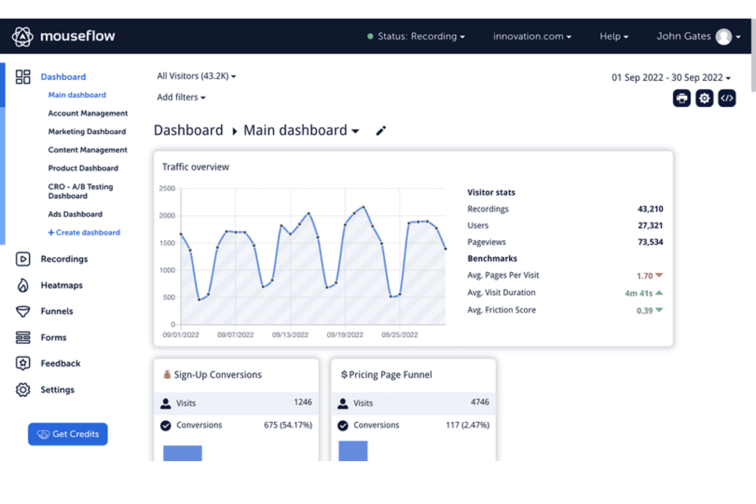
Mouseflow's dashboard tracks traffic, conversions, and visitor behavior metrics. Mouseflow is a web behavior analytics platform that combines session replay, seven heatmap types, friction scoring, form analytics, funnel tracking, and user journey mapping.
Who Is Mouseflow Best For?
Mouseflow is a strong fit for product and UX teams who need to see exactly where users struggle on web products and tie that friction directly to conversion impact.
Why I Picked Mouseflow
Mouseflow earns its spot on my shortlist because no other tool I've tested makes friction as measurable and actionable as this one does. Its proprietary Friction Score rates frustration at the session and page level, and the Friction Insights dashboard ranks your highest-friction pages automatically, so you're never guessing where to start. I also like that friction heatmaps show rage clicks, dead clicks, and stuck points visually, making it easy to connect a spike in frustration to a specific element on a specific page.
Mouseflow Key Features
- Session replay filtering: Filter recorded sessions by device, traffic source, rage clicks, Friction Score, and more to zero in on the sessions that matter most.
- Form analytics: Track field-level hesitation, skipped fields, blank submissions, and abandonment across native, third-party, and embedded forms.
- Conversion funnel tracking: Build no-code funnels with regex support, compare multiple funnels side by side, and see missed revenue at each drop-off step.
- Mina AI summaries: An AI assistant that analyzes friction signals across replays, heatmaps, and funnels and surfaces actionable UX recommendations in natural language.
Mouseflow Integrations
Mouseflow offers 42 documented native integrations, including Google Analytics, Adobe Analytics, Google Tag Manager, Google Ads, Shopify, WordPress, HubSpot, Slack, Microsoft Teams, and Zendesk. Its Open REST API supports custom integrations.
Pros and Cons
Pros:
- Captures seven distinct heatmap views
- Links replay insights to conversion impact
- Quantifies friction with proprietary scoring
Cons:
- Offers limited technical performance diagnostics
- Lacks native mobile app tracking
Learn more about Mouseflow: Best for session replay insights
- Free plan + free demo available
- Pricing upon request
Visit WebsiteRating:4.5/5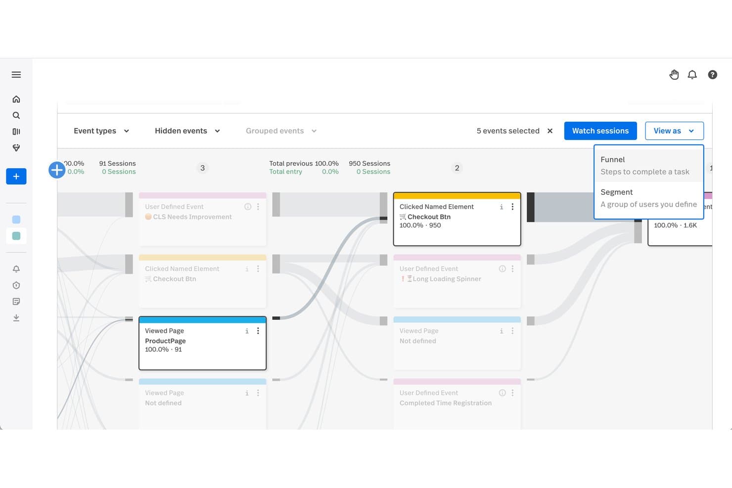
Fullstory lets users visualize user journeys across key interaction events. Fullstory is a user experience monitoring platform that captures sessions through tagless autocapture and combines session replay, heatmaps, funnel analysis, friction detection, and AI-powered behavioral summaries across web and native mobile apps.
Who Is Fullstory Best For?
Fullstory is a strong fit for product managers and UX teams who need to connect session replay data directly to funnel drop-off, friction signals, and revenue impact.
Why I Picked Fullstory
Fullstory earns its spot on my shortlist because session replay here isn't just video playback—it's tied directly to friction signals like rage clicks, dead clicks, and thrashed cursor movement, so I can pinpoint exactly where users struggle without manually scrubbing through recordings. I particularly like StoryAI Opportunities, which automatically surfaces friction points ranked by revenue impact, turning hours of replay review into a prioritized action list. The Frustrated Sessions card, available even on the free plan, surfaces the 10 most friction-heavy sessions instantly.
Fullstory Key Features
- Tagless autocapture: Fullstory records all user interactions automatically, with no manual event tagging required.
- Dev Tools sync: Console logs, network request waterfalls, and JavaScript errors are captured and synced directly to the session replay timeline.
- Journeys analysis: Multi-step user paths are mapped across single or multiple sessions, with segment comparison and session filtering at each step.
- Privacy masking: Sensitive elements are redacted on-device before transmission, with customizable masking rules that can be updated without redeploying your app.
Fullstory Integrations
Fullstory documents integrations with Jira, Slack, Microsoft Teams, Google Analytics, Google Tag Manager, Salesforce, Shopify, Tealium, Twilio Segment, and Zendesk. It also offers APIs, webhooks, data exports, and Zapier for custom connectivity.
Pros and Cons
Pros:
- Developer errors align with user behavior
- StoryAI ranks issues by revenue impact
- Session replays reveal friction context
Cons:
- Replay review still demands substantial time
- Advanced analysis requires higher-tier plans
Learn more about Fullstory: Best for mobile app behavior analytics
- Free plan available
- Pricing upon request
Visit WebsiteRating:4.6/5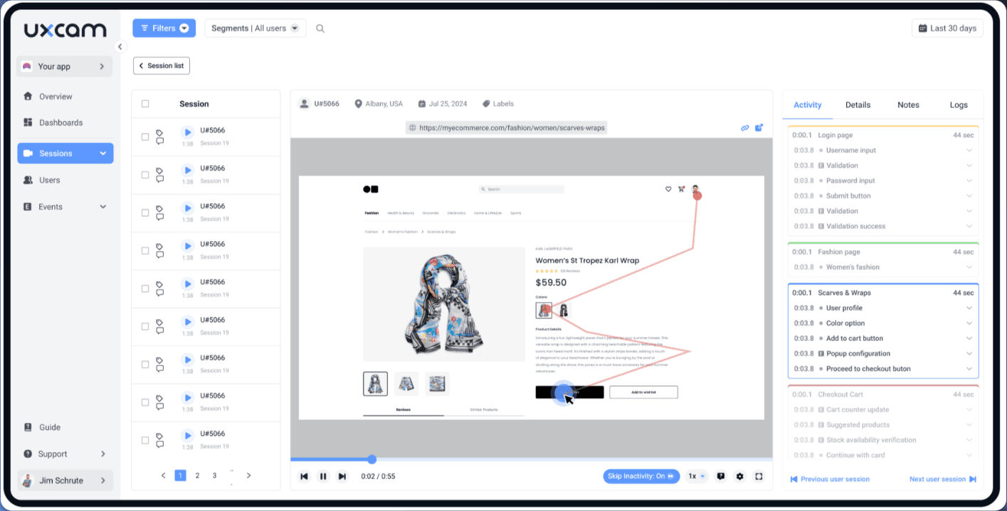
UXCam offers mobile app analytics for product managers and developers. UXCam is a mobile-first product analytics platform that combines session replay, touch and web heatmaps, funnel analysis, journey mapping, and AI-driven friction detection across native and cross-platform mobile apps and websites.
Who Is UXCam Best For?
UXCam is a strong fit for mobile product teams who need to understand in-app user behavior across iOS, Android, and cross-platform frameworks.
Why I Picked UXCam
UXCam earns its spot on my shortlist because no other tool I've tested matches its depth of mobile-native behavior analytics. I love how rage tap detection, UI freeze tracking, and Screen Flow journey mapping all feed directly into session replays, so when I see a drop-off in a funnel, I can click straight into the recordings of users who abandoned. Tara AI takes it further by surfacing the friction points I'd otherwise spend hours finding manually.
UXCam Key Features
- Smart Filters: Search sessions using natural-language queries like "sessions with crashes in the last 7 days" without manually setting up complex filter rules.
- Cross-platform SDK support: A single SDK covers native iOS, Android, React Native, Flutter, and other frameworks, capturing mobile behavior across all of them.
- Privacy masking controls: Automatically occludes passwords and detected PII patterns, with dashboard-configurable screen-blur rules that don't require a developer to update.
- Retention analytics: Track user cohorts over time and reuse saved cohorts as filters across funnels, dashboards, and other reports.
UXCam Integrations
UXCam has eight documented integrations, including Segment, Amplitude, Firebase Crashlytics, Firebase Google Analytics, Intercom, Survicate, Slack, and Microsoft Teams. Its Data Access API supports custom connections and exports raw and aggregated data.
Pros and Cons
Pros:
- Tara prioritizes friction by user impact
- Funnels connect drop-offs to session replays
- Mobile-native crash and freeze diagnostics
Cons:
- Dashboard can overwhelm with data
- Web performance monitoring remains limited
Learn more about UXCam: Best for product and funnel behavior analysis
- Free plan available
- From $250/month
Visit WebsiteRating:4.5/5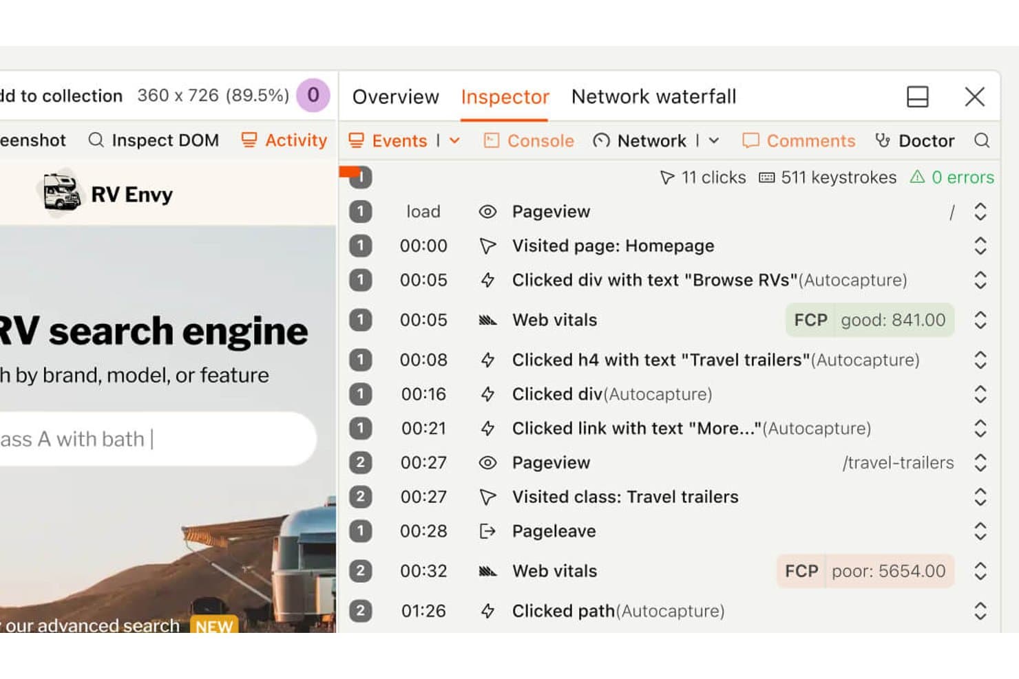
PostHog's session replay timeline tracks user clicks and page vitals. PostHog is a product analytics and user experience monitoring platform that combines session replay, heatmaps, funnel analysis, user paths, error tracking, and web vitals into a single connected toolset.
Who Is PostHog Best For?
PostHog is a strong fit for product managers and developers at tech-forward teams who want session replay, funnels, and behavioral analytics in one place without paying per seat.
Why I Picked PostHog
I picked PostHog as one of the best because its funnel and path analysis is the tightest I've seen in this category. When a funnel step shows drop-off, I can click directly into the sessions behind that cohort—no exporting, no switching tools. The correlation analysis then surfaces which user properties or events actually predict conversion, so I'm not just watching replays blindly.
PostHog Key Features
- Session replay with DevTools sync: Each recording includes a synced panel showing console logs, network requests, and errors at the exact moment they occurred in the session.
- Rage click and dead click autocapture: PostHog automatically captures rage clicks and dead clicks without manual instrumentation, flagging them as friction signals you can filter replays by.
- Replay Vision AI scanners: AI-powered scanners review recordings and classify sessions by user intent, frustration score, and outcome, storing results as queryable events you can alert on.
- Threshold and anomaly-detection alerts: Set alerts on trends, funnels, or SQL insights using statistical or machine-learning detectors, with notifications via Slack, email, Teams, Discord, or webhook.
PostHog Integrations
PostHog offers native integrations with GitHub, GitLab, Linear, Jira, Slack, Discord, and Microsoft Teams, plus dozens of real-time data destinations and webhook support. Its API and MCP server support custom workflows and AI coding tools.
Pros and Cons
Pros:
- Error tracking links issues to recordings
- Autocaptures rage clicks and dead clicks
- Funnels connect directly to session replays
Cons:
- Native frustration scoring requires Replay Vision
- Performance monitoring covers few web vitals
Learn more about PostHog: Best for AI-driven error and friction triage
- Free demo available
- From $83/month
Visit WebsiteRating:0.0/5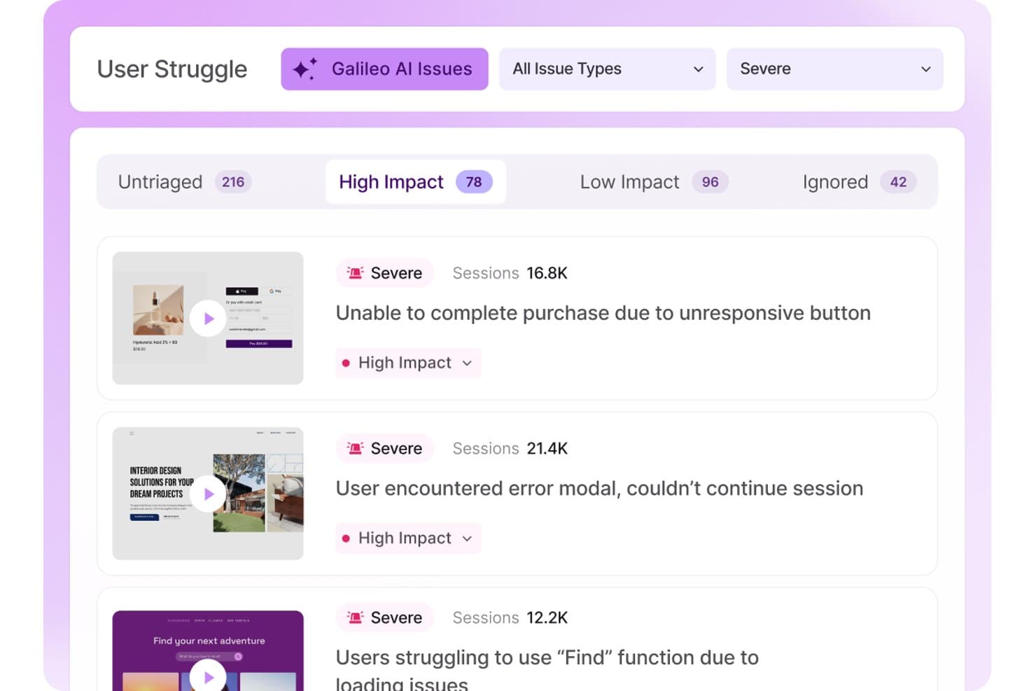
LogRocket surfaces severe user struggle issues by session volume and impact. LogRocket is a user experience monitoring platform that combines session replay, product analytics, error tracking, and frontend performance monitoring across web and native mobile apps.
Who Is LogRocket Best For?
LogRocket is a strong fit for product and engineering teams that need to connect user friction directly to code-level root causes without juggling multiple tools.
Why I Picked LogRocket
I've included LogRocket in my top picks because its Galileo AI cuts through the noise of hundreds of errors to surface the 5–25 issues actually hurting users, complete with plain-language titles and root cause suggestions. I particularly like how Galileo Funnel Insights automatically groups the behavior of users who didn't convert, so I can see exactly where friction killed a flow without manually digging through replays. Paired with rage click and dead click detection linked directly to session recordings, it's a tight loop from signal to diagnosis.
LogRocket Key Features
- Pixel-perfect session replay: Records every user session across web and native mobile apps with full DOM capture, multi-tab support, and Live Mode for watching active sessions in real time.
- Console and network data sync: Replays display alongside console logs, network requests with headers and bodies, Redux state, and stack traces for deep debugging context.
- Conversion funnels: Supports cross-session, ordered or unordered funnel steps with revenue attribution, time-period comparison, and direct drill-down into individual session replays.
- Privacy masking controls: Automatically excludes passwords and third-party iframes, with element-level masking, input sanitization, and network body/header exclusion to support GDPR and HIPAA compliance.
LogRocket Integrations
LogRocket documents 40+ out-of-the-box integrations, including Jira, GitHub, Linear, Sentry, Datadog, Slack, Microsoft Teams, Zendesk, Amplitude, and LaunchDarkly. It also provides an API and data export options for custom workflows.
Pros and Cons
Pros:
- Funnels reveal nonconverting user behavior
- Replays connect errors with technical context
- Galileo prioritizes high-impact friction automatically
Cons:
- Mobile monitoring misses dead-click detection
- Heatmaps exclude URL anchors and query parameters
Learn more about LogRocket: Best for revenue-tied friction prioritization
- Free demo available
- Pricing upon request
Visit WebsiteRating:4.7/5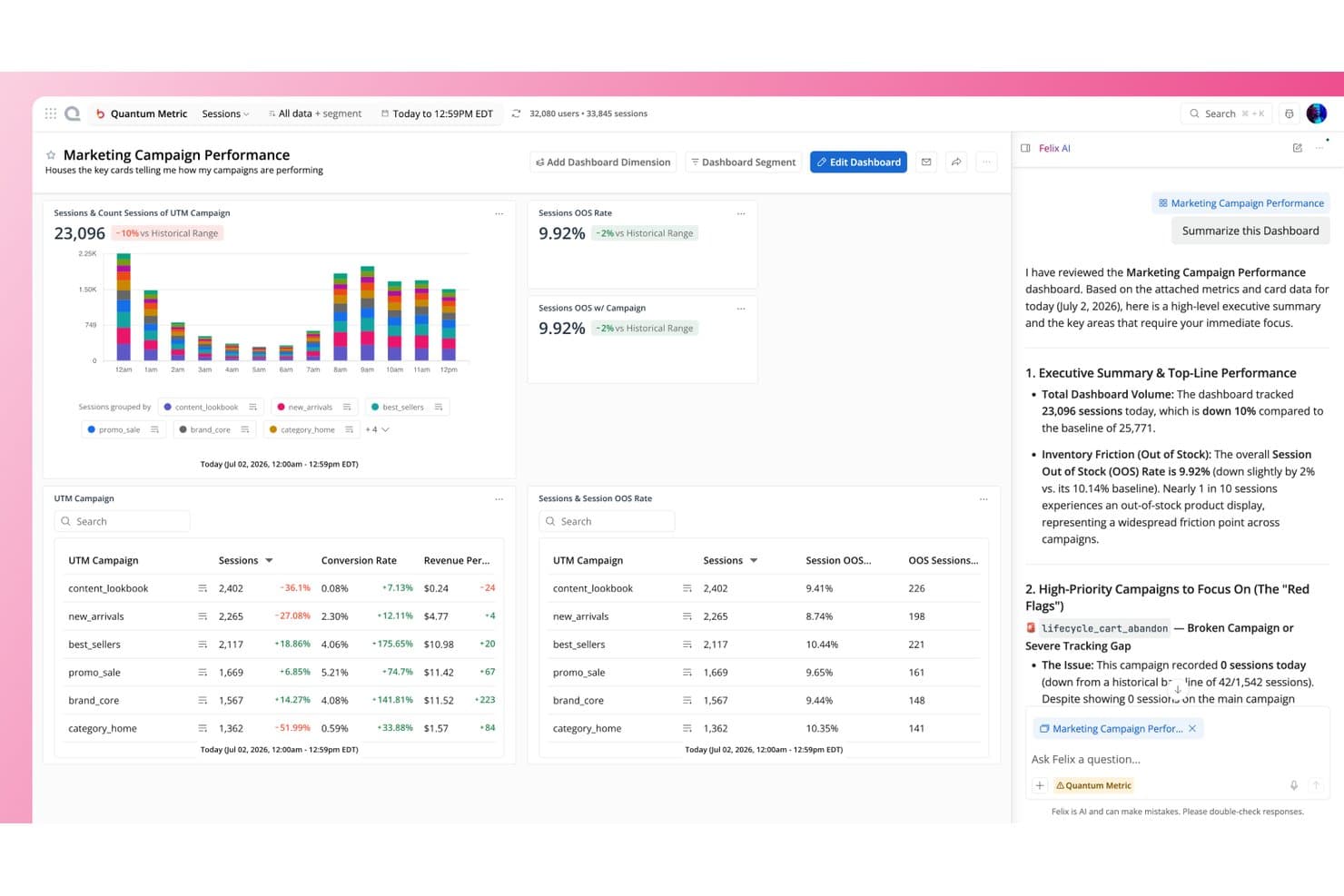
Quantum Metric's Felix AI summarizes campaign dashboards instantly. Quantum Metric is a digital experience analytics platform that combines session replay, heatmaps, journey analysis, friction detection, and AI-driven opportunity analysis across web, mobile, and kiosk.
Who Is Quantum Metric Best For?
Quantum Metric is a strong fit for enterprise product and digital teams who need to tie UX friction directly to revenue impact before deciding what to fix first.
Why I Picked Quantum Metric
Quantum Metric earns its spot on my shortlist because it's the only tool I've seen that automatically ranks friction points by revenue impact, so your team isn't guessing what to fix first. Its Opportunity Analysis does this out of the box: one click sizes the dollar cost of any issue across a funnel step, and it pulls up session replays of affected users instantly. Felix Agentic agents then monitor KPIs like funnel drop-off continuously and explain root causes in plain language.
Quantum Metric Key Features
- Felix AI session summarization: An AI layer built on Gemini Pro summarizes individual sessions and cross-session journeys, then answers follow-up questions in plain language.
- Experience Alerts: Pre-configured, anomaly-based alerts monitor frustration signals, conversion funnels, and page-speed drops in real time, with multi-channel delivery via email, Slack, or webhook.
- Autocapture with visual event editor: A single JS tag or SDK captures 60+ behavioral and friction indicators automatically, and non-engineers can define custom events through a point-and-click editor.
- Device-side PII encryption: Personal data is encrypted on the user's device using RSA 2048 and AES 256 before transmission, with only the customer holding the private key.
Quantum Metric Integrations
Quantum Metric offers integrations with Optimizely, AB Tasty, Split, Salesforce Service Cloud, Qualtrics, Medallia, Adobe Analytics, Looker, Splunk, Slack, and 50+ more. It also supports REST API access and webhooks for custom connectivity.
Pros and Cons
Pros:
- Mobile journeys support cross-device analysis
- Replays connect behavior with technical errors
- Revenue impact clarifies friction priorities
Cons:
- Mobile capture can reduce frame rates
- Search and segment loading can lag
Learn more about Quantum Metric: Best for enterprise feedback and behavior pairing
- Free demo available
- Pricing upon request
Visit WebsiteRating:4.6/5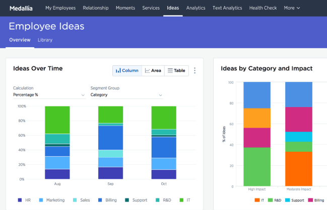
Medallia enhances business transformation for customers and employees. Medallia Digital Experience Analytics (DXA) is a user experience monitoring platform that captures session replays, heatmaps, funnel and journey analysis, real-time experience scoring, and in-app feedback—all paired with AI-driven behavioral insights across web and native mobile.
Who Is Medallia Best For?
Medallia DXA is built for enterprise teams that need to connect behavioral data—replays, heatmaps, and journey analysis—directly to voice-of-customer feedback programs.
Why I Picked Medallia
Medallia earns its spot on my shortlist because it's the only tool I've seen that genuinely closes the loop between what users do and what they say. I love how each Digital Feedback survey response pairs directly with its session replay, so you can watch the exact journey behind a frustrated score. The Digital Experience Score adds another layer, rating every session from 0 to 10 across five behavioral pillars and surfacing revenue-ranked pages so your team knows which friction points cost the most.
Medallia Key Features
- Sunburst journey visualization: Maps every unique path users take through your site or app, so you can see where sessions diverge and where drop-off happens.
- Multiple heatmap types: Offers behavioral, scroll and dot, attribution, and hybrid attention heatmaps, each surfacing a different layer of on-page interaction data.
- Real-time interaction triggers: Detects frustration or engagement signals as they happen and fires live chat, promotions, or surveys in response.
- Native mobile SDK support: Covers iOS, Android, Flutter, and React Native with session replay, heatmaps, crash reporting, and network error tracking built in.
Medallia Integrations
Medallia offers native integrations with Adobe Analytics, Adobe Target, Adobe Audience Manager, Adobe Experience Platform, Slack, and Invoca. It also supports open APIs, webhooks, data streams, Google Tag Manager, and marketplace connectivity through Medallia Xchange.
Pros and Cons
Pros:
- Scores sessions across five experience pillars
- Ranks friction by potential revenue impact
- Pairs feedback responses with session replays
Cons:
- Advanced replays require a Chrome extension
- Web performance lacks confirmed Core Web Vitals
Learn more about Medallia: Best for heatmap analytics
- Free plan available
- From $39/month (billed annually)
Visit WebsiteRating:4.5/5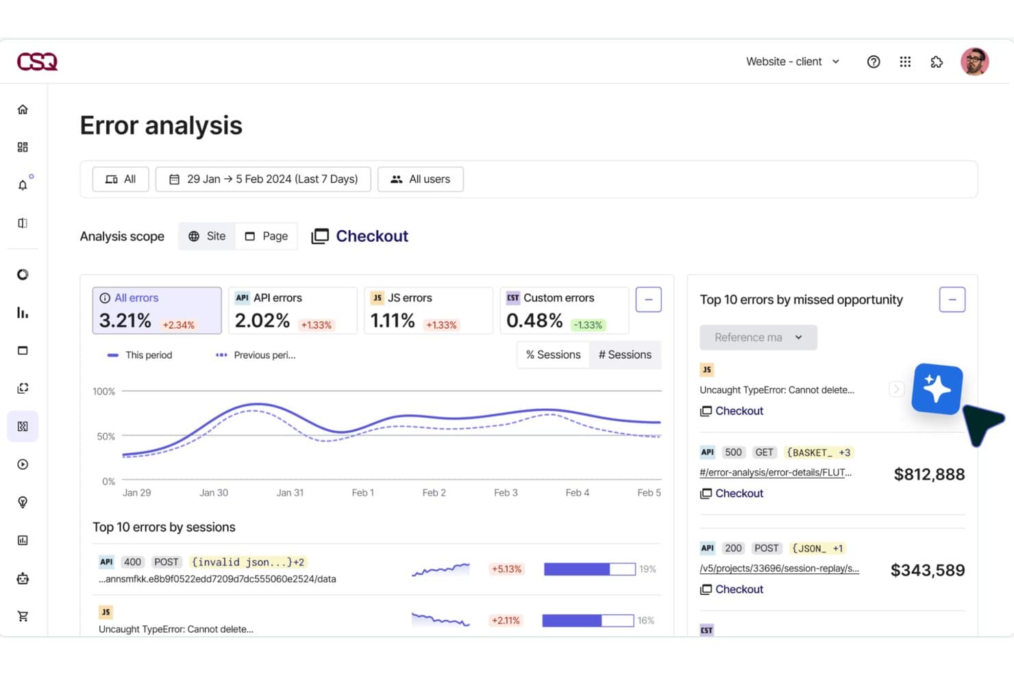
Hotjar (by Contentsquare) surfaces revenue lost to checkout errors. Hotjar (by Contentsquare) is a user experience monitoring platform that combines session replay, heatmaps, funnel analysis, friction detection, and frontend performance monitoring in a single tool.
Who Is Hotjar (by Contentsquare) Best For?
Hotjar is a strong fit for UX researchers and product managers who need visual behavior data—heatmaps, session replays, and funnel drop-off analysis—without a steep learning curve.
Why I Picked Hotjar (by Contentsquare)
Hotjar earns its spot on my shortlist because its heatmap capabilities go further than any other tool I've tested. Beyond standard click maps, it generates zone-based revenue heatmaps that show conversion rate and revenue per page element, so you can see exactly which CTA or product image is pulling its weight. I also love how one click takes you from a heatmap directly into the matching session replays, closing the loop between aggregate behavior and individual user context.
Hotjar (by Contentsquare) Key Features
- Frustration score: Automatically detects rage clicks, dead clicks, and repeated form field errors, then ranks each issue by its estimated business impact.
- Smart Capture: Records every user interaction automatically with no manual tagging, including privacy masking of sensitive input fields before data leaves the browser.
- Funnel analysis: Lets you build multi-step funnels without code and links each drop-off point directly to the matching session replays for immediate context.
- Sense AI summaries: Generates plain-language summaries of individual replays and heatmaps, with cross-session summaries available on Pro and Enterprise plans.
Hotjar (by Contentsquare) Integrations
Contentsquare lists 10+ integrations, including Google Analytics, Jira, Slack, Microsoft Teams, HubSpot, Segment, Mixpanel, Optimizely, Shopify, and Zapier. Pro plans include API access for custom integrations.
Pros and Cons
Pros:
- AI summaries reduce manual replay review
- Session replays connect friction to context
- Revenue-ranked heatmaps clarify UX priorities
Cons:
- Advanced error diagnostics require higher tiers
- Replay sampling limits full behavioral coverage
Learn more about Hotjar (by Contentsquare): Best for friction detection in regulated industries
- Free demo available
- Pricing upon request
Visit WebsiteRating:4.7/5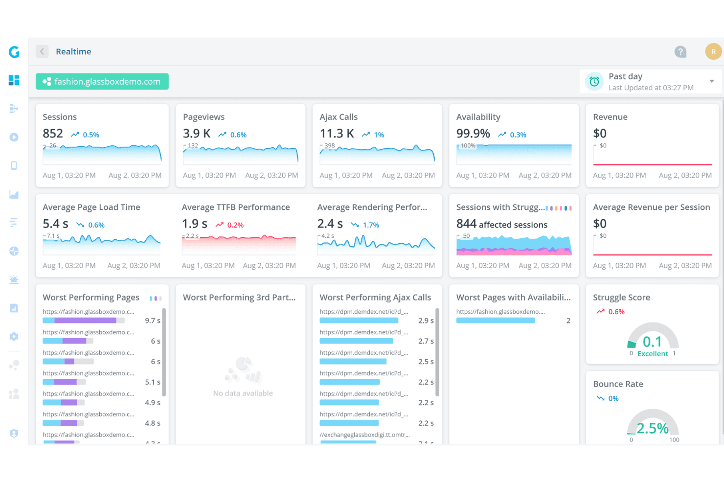
Glassbox offers a real-time analytics dashboard displaying sessions, pageviews, Ajax calls, availability, page load times, and struggle scores for a demo fashion website. Glassbox is a digital experience analytics platform that captures 100% of user sessions with tagless technology, combining session replay, interaction maps, funnel analysis, struggle detection, and real user monitoring across web and native mobile apps.
Who Is Glassbox Best For?
Glassbox is a strong fit for enterprise teams in regulated industries—like financial services and insurance—where compliance, privacy controls, and audit-ready session records are non-negotiable.
Why I Picked Glassbox
I picked Glassbox as one of the best because its Struggle Score and Session Vault combination is purpose-built for regulated industries where friction isn't just a UX problem—it's a compliance risk. The Struggle Score flags problem pages using patterns trained on trillions of sessions, while Session Vault stores time-stamped, tamper-proof session records for audit and complaint handling. I also like that its 30+ automatically detected struggle behaviors tie directly to revenue impact, so I can prioritize fixes with real business context.
Glassbox Key Features
- Tagless session capture: Records 1,000+ events per session automatically across web and native mobile apps, with no manual tagging required.
- Augmented Journey Map™: Visualizes cross-channel user journeys with 25+ dimensions, node-level flow analysis, and segmentation by VoC or A/B test data.
- GIA natural-language search: Lets you query sessions in plain language and get AI-generated summaries of sessions and reports through a chat interface.
- Interaction maps: Show click rate, focus time, errors, struggles, and revenue impact per page element, with side-by-side segment comparison tools.
Glassbox Integrations
Glassbox offers documented integrations with Jira, Slack, Microsoft Teams, AppDynamics, New Relic, Splunk, Adobe Analytics, Google Analytics, Qualtrics, and Optimizely. An open API supports custom integrations, and tag management connects through Google Tag Manager, Adobe Launch, and Tealium.
Pros and Cons
Pros:
- Preserves tamper-proof sessions for audits
- Links friction to revenue impact
- Captures every interaction without manual tagging
Cons:
- Filters and reports can confuse new users
- Replay coverage varies by package
Learn more about Glassbox: Best for full-stack frontend and backend correlation
- 14-day free trial
- From $0.15/month (billed annually)
Visit WebsiteRating:0.0/5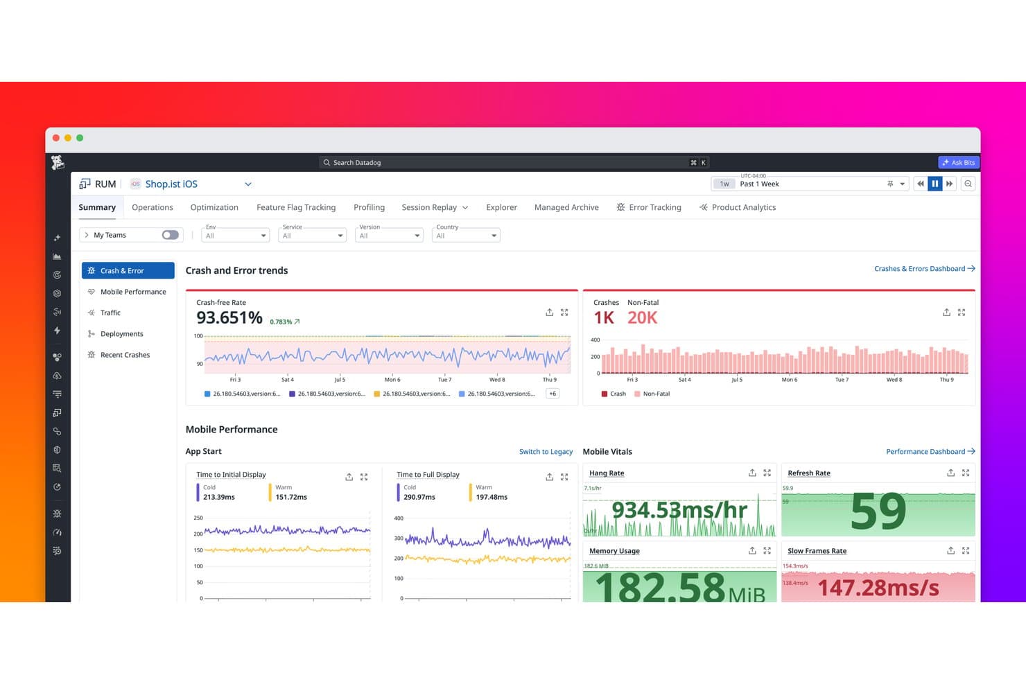
Datadog Real User Monitoring tracks crash rates, errors, and mobile performance metrics. Datadog Real User Monitoring is a digital experience monitoring platform that captures real user sessions, surfaces behavioral data through heatmaps and funnels, tracks frontend performance metrics, and connects user-facing signals directly to backend traces and logs.
Who Is Datadog Real User Monitoring Best For?
Datadog RUM is a strong fit for engineering and product teams that need to connect frontend user behavior directly to backend performance data in a single platform.
Why I Picked Datadog Real User Monitoring
Datadog RUM earns its spot on my shortlist because it's the only tool I've used where a rage click on a checkout button connects directly to a backend trace showing a slow database query. I love that RUM Without Limits lets you ingest every session, calculate performance metrics across all of them, and then selectively retain only the ones that matter, like sessions with errors or abandoned purchases. Watchdog Insights automatically surfaces outliers, flagging when a specific app version or browser is driving a spike in frustration signals.
Datadog Real User Monitoring Key Features
- RUM Without Limits: Ingest 100% of user sessions and use no-code retention filters to keep only the sessions that matter, such as those with errors or abandoned purchases.
- Frustration signals dashboard: Automatically collects rage clicks, dead clicks, and error clicks, and surfaces them in a dedicated dashboard with replay timeline markers.
- Mobile session replay: Captures native iOS and Android sessions as wireframe-based replays, with separate privacy controls for text, images, and touches.
- Error Tracking: Groups frontend errors into issues with source-mapped stack traces, crash reports, and visibility into which user segments are affected.
Datadog Real User Monitoring Integrations
Datadog RUM integrates natively with APM, Log Management, Synthetics, Error Tracking, Profiling, Feature Flags, Jira, Slack, and Confluence. It also offers a Zendesk Marketplace app, APIs for custom integrations, and access to more than 1,000 integrations across the Datadog platform.
Pros and Cons
Pros:
- Surfaces rage clicks and error outliers
- Captures every session before retention filtering
- Correlates frontend friction with backend traces
Cons:
- Requires manually building experience scores
- Heatmaps exclude mobile sessions
Learn more about Datadog Real User Monitoring:
Other User Experience Monitoring Tools
Here are some additional user experience monitoring tools options that didn’t make it onto my shortlist, but are still worth checking out:
- 11New Relic Browser MonitoringBest for engineering-led UX and frontend debugging
- 12DynatraceBest for AI-driven root cause analysis
- 13Crazy EggBest for A/B testing with behavioral data
- 14SmartlookBest for web and mobile behavior analysis
- 15SplunkBest for visualizing UX data across full-stack traces
- 16OpenReplayBest for open-source session replay and debugging
- 17Microsoft ClarityBest for free, no-limit behavioral analytics
How I Evaluate User Experience Monitoring Tools
I split my evaluation into three parts. Core functionality—capturing real user sessions and visualizing behavior through heatmaps—carries the most weight. Then I look at distinguishing features like privacy masking controls, and finally consider onboarding speed and pricing value.
Core Functionality (Table Stakes For This List)
When I'm selecting tools for my list, I score each one on a scale from 0 (does not offer the functionality) to 5 (excels in this area) for each core functionality listed below. I then convert the total into a percentage to help assess each tool's overall fit, with extra weight on any functionalities I've deemed essential.
- Session Capture (Essential): I evaluate replay fidelity, search filters, and cross-device coverage to see if I can trace a single user's path from entry to drop-off.
- Behavioral Visualization (Essential): Heatmap variety matters here. I look for click, scroll, and movement maps with segment filtering so I can compare behavior across cohorts.
- Frontend Performance Monitoring: I check whether the tool ties page load times and latency back to specific user sessions, not just aggregate dashboards disconnected from real behavior.
- Friction and Error Detection: Rage clicks and dead clicks are table stakes. I look for tools that surface JavaScript errors alongside the session where they occurred.
- Funnel and Journey Analysis: I evaluate how easily I can build multi-step funnels and spot where users abandon a flow, like a checkout sequence or onboarding wizard.
- Experience Scoring and Alerting: Real-time alerts that flag experience degradations before users complain are what I'm after. Tools like Dynatrace and Contentsquare approach this differently.
Once I have a list of tools that meet the criteria, I consider what sets each platform apart.
Differentiating Factors (What Sets Vendors Apart)
Here's how I compare and contrast different vendors:
Standout Features
Privacy masking controls matter most when your product handles sensitive data. I evaluate how granularly each tool lets you redact PII—Hotjar and FullStory handle this differently, and the gap shows up fast in regulated industries. Cross-platform mobile support is the other dealbreaker. I check whether heatmaps and session replay extend to native iOS and Android apps, not just mobile web views. If your team ships across platforms, tools that only cover the browser leave major blind spots in your behavioral data.
Beyond Features
I evaluate how quickly a tool gets to first insight. Some platforms, like FullStory, offer tag-manager deployment that skips lengthy engineering cycles, while others require dedicated SDK work that can stall a rollout. Compliance alignment matters just as much—I check for built-in consent management and data residency options, especially for teams shipping products across multiple jurisdictions. I also look at native integrations with tools like Jira, Amplitude, and Slack, since behavioral insights lose value when they sit outside your team's actual workflow.
How to Choose User Experience Monitoring Tool
It’s easy to get bogged down in long feature lists and complex pricing structures. To help you stay focused as you work through your unique software selection process, here’s a checklist of factors to keep in mind:
| Factor | What to Consider |
| Scalability | Ensure the tool can grow with your business. Consider if it can handle increased user data without slowing down. |
| Integrations | Check if the tool integrates with your existing systems like CRM, CMS, or analytics platforms, to streamline workflows. |
| Customizability | Look for options to tailor dashboards and reports to fit your team’s specific needs and objectives. |
| Ease of Use | Choose a tool with an intuitive interface that minimizes the learning curve for your team. |
| Budget | Evaluate if the tool offers good value for money and if its pricing aligns with your budget constraints. |
| Security Safeguards | Ensure the tool complies with data protection regulations and has measures in place to protect user data. |
| Support | Consider the quality and availability of customer support, including live chat, email, and phone options. |
| Performance | Evaluate how well the tool performs in real-time data processing and its reliability for continuous monitoring. |
Trends In User Experience Monitoring Tool
In my research, I sourced countless product updates, press releases, and release logs from different user experience monitoring tools vendors. Here are some of the emerging trends I’m keeping an eye on:
- AI-Driven Insights: Many tools are now using AI to provide deeper insights into user behavior. This helps teams predict user needs and tailor experiences accordingly. Vendors like Dynatrace are leveraging AI to enhance their monitoring capabilities.
- Real-Time Collaboration: Tools are adding features that allow teams to collaborate in real-time on user data. This fosters quicker decision-making and problem-solving. Fullstory, for instance, offers real-time collaboration features to enhance team workflows.
- Privacy-Centric Features: As privacy concerns grow, tools are integrating features that allow businesses to monitor user experiences while respecting privacy. This includes anonymizing user data and offering compliance tools, which are becoming standard in many platforms.
- Cross-Device Analysis: Understanding user behavior across multiple devices is becoming more and more important. Tools now offer more comprehensive cross-device analysis to track user journeys easily. Nexthink has introduced features that enable detailed cross-device tracking.
- User Journey Mapping: Tools are focusing on providing detailed user journey maps to visualize every step a user takes. This helps businesses identify friction points and optimize the user experience. Companies like Contentsquare are leading with advanced journey mapping features.
What Is An Experience Monitoring Tool?
User experience monitoring tools are software solutions designed to track and analyze how users interact with a website or application. These tools are commonly used by UX designers, product managers, and digital marketers to improve user satisfaction and optimize digital experiences. Real-time analytics, session replays, and heatmaps help teams understand user behavior and identify areas for improvement. Overall, these tools provide valuable insights that lead to enhanced user experiences and better business outcomes.
Features of User Experience Monitoring Tools
- Real-time analytics: Track performance metrics and detect latency issues instantly, helping teams with troubleshooting and root cause analysis as well as automatic notifications of any updates.
- Session replays & heatmaps: Analyze behavior from the end user’s perspective, visualizing friction points and performance bottlenecks that impact engagement.
- AI-powered insights: Use AI-driven analytics to uncover patterns, predict behavior, establish benchmarks, and enhance user experience metrics.
- Cross-device tracking: Ensure a consistent user experience across devices while monitoring page load times and backend connectivity.
- Customizable dashboards: Focus on key KPIs and performance indicators with tailored reporting.
- Privacy-centric & compliance features: Cloud-based solutions protect user data with anonymization tools and built-in observability for regulatory compliance.
- Collaboration tools: Share insights across teams to correlate data and improve decision-making.
Benefits of User Experience Monitoring Tools
Implementing end-user experience monitoring (EUEM) tools offers several advantages for your team and business:
- Better user satisfaction: This type of monitoring solution allows session replays and heatmaps to help identify and fix friction points, enhancing the overall end-user experience.
- Data-driven decision-making: With real-time analytics and AI-powered insights, teams can make informed choices based on performance data and user behavior.
- Improved website performance: Performance monitoring ensures faster page load times, reducing bounce rates and enhancing engagement.
- Enhanced troubleshooting: Identify root causes of performance bottlenecks with observability tools, leading to quicker remediation of issues.
- Stronger cross-team collaboration: Collaboration tools make it easy to share findings, improving alignment across DevOps, marketing, and IT teams.
- Higher conversion rates: Optimizing user journeys based on real interaction data can boost conversion rates and revenue.
- Privacy compliance: Built-in privacy controls help maintain compliance with regulations while preserving user trust.
- Consistent cross-device experience: End-user monitoring ensures users have a easy experience across all devices and platforms.
Costs and Pricing of User Experience Monitoring Tools
Selecting user experience monitoring tools requires an understanding of the various pricing models and plans available. Costs vary based on features, team size, add-ons, and more. The table below summarizes common plans, their average prices, and typical features included in user experience monitoring tools solutions:
Plan Comparison Table for User Experience Monitoring Tools
| Plan Type | Average Price | Common Features |
| Free Plan | $0 | Basic analytics, limited session replays, and minimal data storage. |
| Personal Plan | $5-$25 /user /month | Advanced analytics, heatmaps, session replays, and email support. |
| Business Plan | $30-$100 /user /month | Comprehensive analytics, user journey mapping, priority support, and custom API integrations. |
| Enterprise Plan | $100+ /user/month | Customizable dashboards, dedicated account management, full data access, and SLA-backed support. |
User Experience Monitoring Tools FAQs
Here are some answers to common questions about user experience monitoring tools:
Which monitoring tool is used to monitor a user's experience when using an application or website?
Real User Monitoring (RUM) tools are used to capture and analyze every user interaction within a software application in real time. They provide insights from actual users’ experiences, unlike synthetic monitoring tools that simulate users. RUM helps you understand real-world user interactions and improve the application experience.
What is the difference between APM and digital experience monitoring?
Application Performance Management (APM) focuses on monitoring application performance from a technical standpoint, optimizing the technology stack. Digital Experience Monitoring (DEM) measures the impact of application performance on the user. It provides insights into how performance issues affect user satisfaction and engagement.
How do you measure end user experience?
Measuring end user experience involves analyzing both quantitative and qualitative data. Quantitative metrics include task completion rates, error rates, and time spent on tasks. These metrics help you understand usability and efficiency, providing insights into how users interact with your application.
How can user experience monitoring improve my business?
User experience monitoring helps your business by identifying areas of friction and opportunities for improvement. By understanding user behavior, you can optimize your digital products to enhance satisfaction and increase conversion rates. This leads to better customer retention and overall business growth.
What are the challenges in implementing user experience monitoring tools?
Challenges include integrating the tools with existing systems, ensuring data privacy, and handling large volumes of data. It’s important to choose a tool that aligns with your team’s technical expertise and infrastructure. Proper implementation ensures you get the most value from the monitoring tools.
How do privacy regulations affect user experience monitoring?
Privacy regulations require you to handle user data responsibly. Monitoring tools must comply with laws like GDPR, ensuring data is anonymized and securely stored. This protects user privacy while allowing you to gather insights needed to improve user experiences.
What's Next?
If you're in the process of researching user experience monitoring tools, connect with a SoftwareSelect advisor for free recommendations.
You fill out a form and have a quick chat where they get into the specifics of your needs. Then you'll get a shortlist of software to review. They'll even support you through the entire buying process, including price negotiations.