

10 Mejores Alternativas a Tableau Analizadas en 2026

Mejores alternativas a Tableau en resumen


Navegar por las complejidades de la visualización de datos puede ser abrumador. Si sientes que Tableau no está cumpliendo con tus necesidades, no eres el único. Muchos gerentes de producto buscan alternativas que ofrezcan mayor personalización, facilidad de uso o características específicas para afrontar los retos únicos de sus equipos.
En mi experiencia, la herramienta adecuada puede transformar la forma en la que interpretas los datos, haciéndolos accesibles y accionables para tu equipo. He probado y revisado de manera independiente diferentes programas para encontrar las mejores alternativas a Tableau que se adapten a distintas necesidades.
En este artículo, te guiaré a través de mis opciones principales, enfocándome en cómo cada alternativa puede resolver tus desafíos específicos. Vamos a encontrar la mejor opción para el camino impulsado por datos de tu equipo.
¿Qué es Tableau?
Tableau es un software de inteligencia de negocios y visualización de datos que te ayuda, junto a tu equipo, a entender datos complejos. Es comúnmente utilizado por analistas de datos, profesionales de business intelligence y gerentes de producto que necesitan extraer conclusiones claras de sus datos. Su funcionalidad de arrastrar y soltar, análisis de datos en tiempo real y paneles interactivos facilitan convertir datos sin procesar en información accionable. En general, Tableau brinda a tu equipo una herramienta para visualizar datos de manera efectiva, facilitando la toma de decisiones informada.
Resumen de las mejores alternativas a Tableau
Esta tabla comparativa resume los detalles de precios de mis selecciones principales de alternativas a Tableau para ayudarte a encontrar la mejor opción según tu presupuesto y necesidades de negocio.
| Tool | Best For | Trial Info | Price | ||
|---|---|---|---|---|---|
| 1 | Ideal para análisis basados en IA | Prueba gratuita de 30 días + demostración gratuita disponible | Desde $300/mes (facturado anualmente) | Website | |
| 2 | Ideal para análisis integrados | Prueba gratuita de 30 días + demostración gratuita disponible | Precio bajo solicitud | Website | |
| 3 | Ideal para la observabilidad de datos | Plan gratuito + prueba gratuita disponible | Desde $19/mes + uso | Website | |
| 4 | Ideal para usar con el ecosistema de Google | Plan gratuito disponible | Desde $9/usuario/proyecto/mes | Website | |
| 5 | Ideal para la integración con Microsoft | Plan gratuito disponible | Desde $14/user/month (facturado anualmente) | Website | |
| 6 | Ideal para analítica de código abierto | Plan gratuito disponible | Desde $90/mes (facturado anualmente) | Website | |
| 7 | Ideal para soluciones personalizables | Prueba gratuita de 7 días + demostración gratuita disponible | Precios disponibles previa solicitud | Website | |
| 8 | Ideal para obtener información en tiempo real | Prueba gratuita de 14 días + demostración gratuita disponible | Desde $25/usuario/mes (facturado anualmente) | Website | |
| 9 | Ideal para consultas SQL | No disponible | Precios bajo solicitud | Website | |
| 10 | Ideal para una interfaz de hoja de cálculo | Prueba gratuita + demostración gratuita disponibles | Precios bajo solicitud | Website |
Por Qué Confiar en Nuestras Reseñas de Software
Llevamos revisando y probando software de gestión de productos desde 2020. Como product managers, sabemos lo crucial y complicado que es tomar la decisión correcta al seleccionar software. Invertimos en investigación profunda para ayudar a nuestra audiencia a tomar mejores decisiones de compra de software. Hemos probado más de 2,000 herramientas para distintos casos de uso y escrito más de 1,000 reseñas exhaustivas. Conozca cómo mantenemos la transparencia & nuestra metodología de reseñas de software.
Reseñas de las mejores alternativas a Tableau
A continuación encontrarás mis resúmenes detallados de las alternativas a Tableau que integran mi lista. Mis evaluaciones ofrecen un análisis detallado de las características clave, ventajas y desventajas, integraciones y los mejores casos de uso para ayudarte a elegir la opción adecuada para ti.

Qlik
Ideal para análisis basados en IA

Qlik es una plataforma de inteligencia empresarial que ofrece herramientas de análisis basadas en IA, integración de datos y visualización. Se utiliza en sectores como las finanzas, la atención sanitaria y el comercio minorista para facilitar la toma de decisiones basada en datos.
Por qué Qlik es una buena alternativa a Tableau: los análisis basados en IA de Qlik ofrecen información predictiva que puede ayudar a tu equipo a descubrir patrones ocultos en los datos. La integración de datos en tiempo real de la plataforma garantiza información actualizada para tomar mejores decisiones. Sus herramientas de BI permiten implementaciones tanto en la nube como locales.
Características e integraciones destacadas:
Las características incluyen un motor de datos asociativo que permite explorar conexiones que las herramientas tradicionales podrían no detectar. Tú y tu equipo pueden beneficiarse de su énfasis en la alfabetización de datos, que ofrece recursos para mejorar la comprensión y el uso de los datos por parte de los trabajadores.
Las integraciones incluyen AWS, Google Cloud, Microsoft Azure, SAP y más.
Pros and Cons
Pros:
- Descubrimiento automatizado de tendencias predictivas
- Énfasis en la alfabetización de datos
- Indexación de datos mediante un motor asociativo
Cons:
- Precio inicial más elevado
- Conocimientos especializados de scripts propietarios

Domo
Ideal para análisis integrados
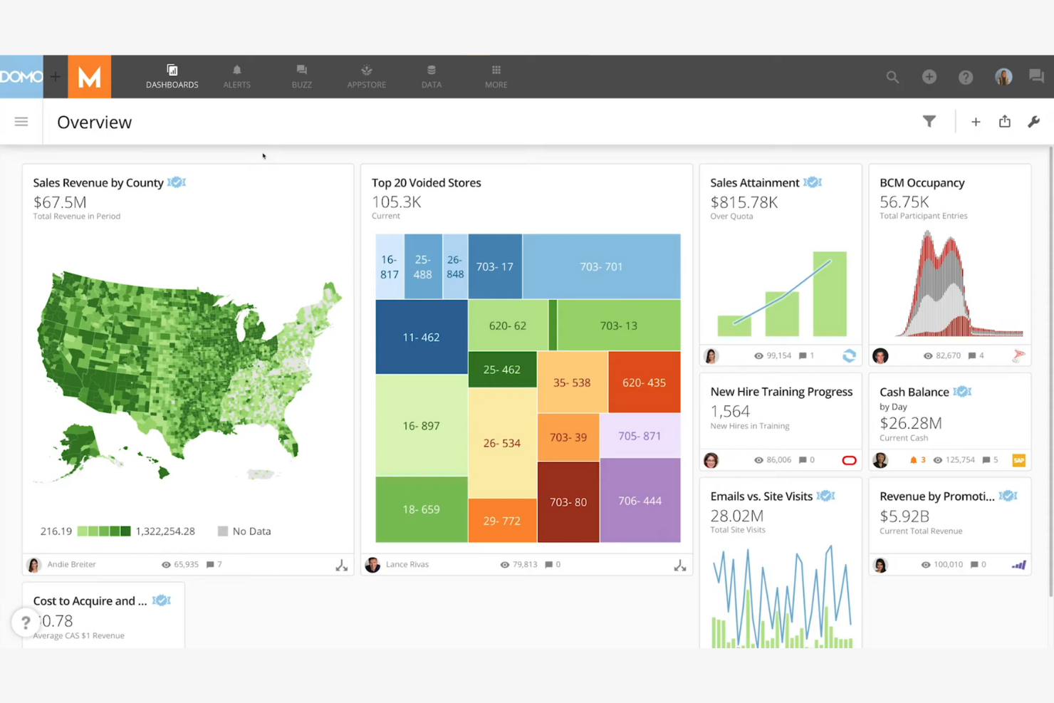
Domo es una plataforma de inteligencia empresarial basada en la nube que te ayuda a ti y a tu equipo a visualizar y analizar datos en tiempo real. Proporciona a los responsables de la toma de decisiones de diversos sectores los conocimientos que necesitan para impulsar el crecimiento empresarial.
Por qué Domo es una buena alternativa a Tableau: Domo destaca en el análisis integrado, lo que permite integrar herramientas de análisis de datos en tus aplicaciones existentes. Sus capacidades de datos en tiempo real garantizan que tu equipo tenga acceso a los conocimientos más actuales. El diseño centrado en dispositivos móviles de la plataforma permite acceder a los datos desde cualquier lugar.
Funciones e integraciones destacadas:
Las funciones incluyen una interfaz de arrastrar y soltar que facilita la creación de paneles personalizados. Puedes automatizar los flujos de trabajo de datos para acelerar las tareas que consumen mucho tiempo. La función de análisis predictivo de la plataforma te ayuda a pronosticar tendencias y tomar decisiones fundamentadas.
Las integraciones incluyen Salesforce, Google Analytics, Amazon Redshift, Microsoft Azure, Dropbox, Box, Slack, HubSpot, Zendesk, Mailchimp y más.
Pros and Cons
Pros:
- Ingesta de canalizaciones de datos de alta frecuencia
- Transformaciones Magic ETL flexibles
- Compatibilidad con análisis integrados
Cons:
- La implementación en varios departamentos requiere tiempo
- Requiere conocimientos técnicos

Grafana
Ideal para la observabilidad de datos
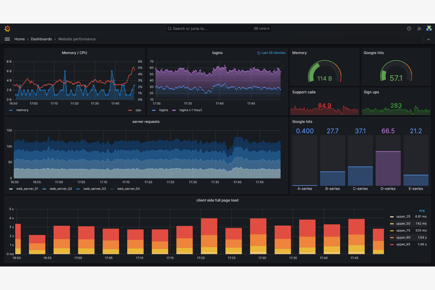
Grafana es una plataforma de código abierto para la monitorización y la observabilidad, utilizada principalmente por equipos de TI y DevOps. Permite visualizar métricas y registros, así como realizar seguimientos en varias fuentes de datos, proporcionando una visión completa del estado de su sistema.
Por qué Grafana es una buena alternativa a Tableau: Grafana destaca en la observabilidad de datos, lo que permite a su equipo supervisar el rendimiento del sistema en tiempo real. La naturaleza de código abierto de la plataforma permite una amplia personalización y mejoras impulsadas por la comunidad.
Características e integraciones destacadas:
Las características incluyen un amplio conjunto de opciones de visualización que le permiten crear paneles detallados. Puede utilizar su función de alertas para configurar notificaciones basadas en umbrales específicos. La plataforma admite complementos, lo que permite ampliar su funcionalidad según sea necesario.
Las integraciones incluyen Microsoft IIS, Istio, Kafka, Linux Server, MongoDB, MySQL, PostgreSQL, SNMP, Windows y más.
Pros and Cons
Pros:
- Amplia observabilidad de datos
- Monitorización del rendimiento en tiempo real
- Sistema de alertas flexible
Cons:
- Requisitos de configuración centrados en DevOps
- Renderizado del navegador que consume muchos recursos

Ideal para usar con el ecosistema de Google
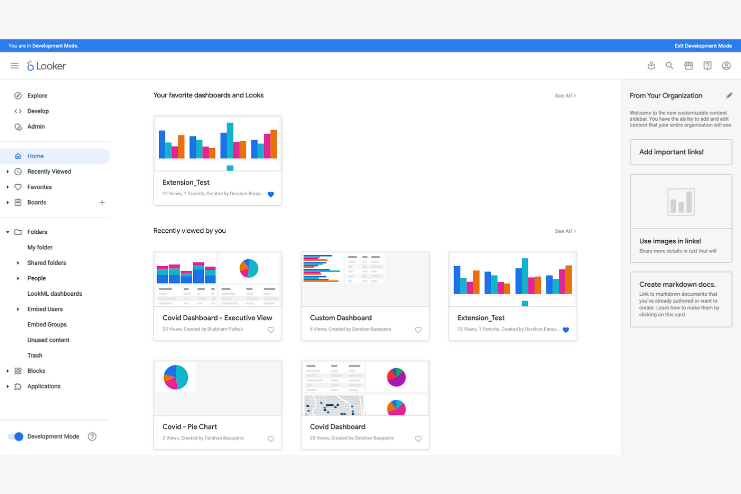
Looker Studio, la nueva versión de Google Data Studio, es una plataforma de análisis y visualización de datos diseñada para usuarios empresariales que desean crear informes y paneles informativos.
Por qué Looker Studio es una buena alternativa a Tableau: Looker Studio se integra con los productos de Google, por lo que es ideal si tu equipo depende del ecosistema de Google. Ofrece capacidades de modelado de datos que te permiten explorar los datos sin necesidad de conocimientos avanzados de SQL. Puedes compartir información de manera eficiente entre tus espacios de trabajo gracias a sus funciones colaborativas y fáciles de usar.
Funciones e integraciones destacadas:
Las funciones incluyen una interfaz de arrastrar y soltar que simplifica la creación de informes. Puedes utilizar visualizaciones personalizadas para representar mejor tus datos. La posibilidad de programar informes te ayuda a mantener a tu equipo actualizado con la información más reciente.
Las integraciones incluyen Google Analytics, Google Ads, BigQuery, Google Sheets, Google Cloud, YouTube Analytics, MySQL, PostgreSQL, Amazon Redshift y mucho más.
Pros and Cons
Pros:
- Vinculación nativa con BigQuery y Workspace
- Modelado de datos sin conocimientos avanzados de SQL
- Interfaz de arrastrar y soltar
Cons:
- Ecosistema restringido de conectores de terceros
- Menor flexibilidad con datos que no son de Google

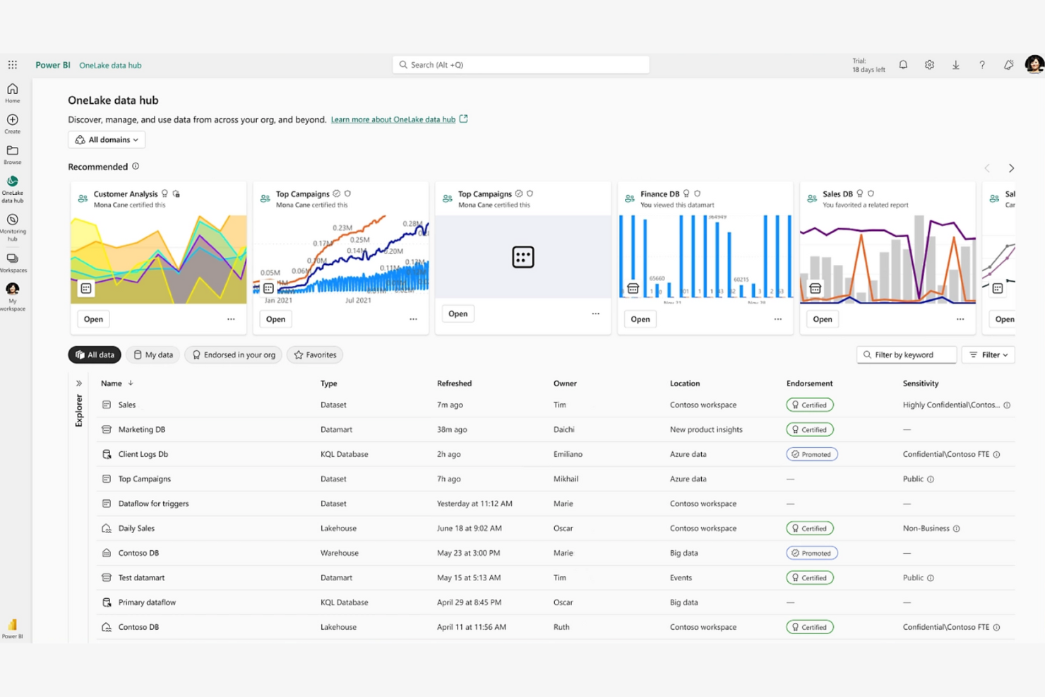
Power BI es una herramienta de inteligencia empresarial y visualización de datos que utilizan los analistas de datos y los profesionales empresariales para visualizar y compartir conocimientos. Esta plataforma de inteligencia empresarial te ayuda a ti y a tu equipo a crear informes y paneles interactivos con facilidad.
Por qué Power BI es una buena alternativa a Tableau: Se integra con los productos de Microsoft, por lo que es ideal si ya utilizas el ecosistema de Microsoft. Su interfaz de arrastrar y soltar, las actualizaciones de datos en tiempo real y los conocimientos basados en IA ofrecen una forma sencilla de analizar los datos. Te resultará útil la función de consultas en lenguaje natural, que te permite hacer preguntas sobre tus datos en un lenguaje sencillo. Es una buena opción si buscas una herramienta que funcione bien con las aplicaciones de Microsoft Office.
Funciones e integraciones destacadas:
Las funciones incluyen capacidades de modelado de datos que te permiten crear modelos de datos complejos sin conocimientos técnicos avanzados. Puedes compartir conocimientos mediante herramientas de colaboración basadas en la nube, lo que hace que el trabajo en equipo sea más eficiente. La compatibilidad con aplicaciones móviles garantiza que puedas acceder a tus conocimientos de datos estés donde estés.
Las integraciones incluyen Microsoft Excel, Salesforce Analytics, Zendesk y mucho más.
Pros and Cons
Pros:
- Interoperabilidad nativa con Office 365
- Compatibilidad con conjuntos de datos de transmisión automatizada
- Consultas en lenguaje natural
Cons:
- Integraciones limitadas con productos que no son de Microsoft
- Requisitos de sintaxis DAX complejos

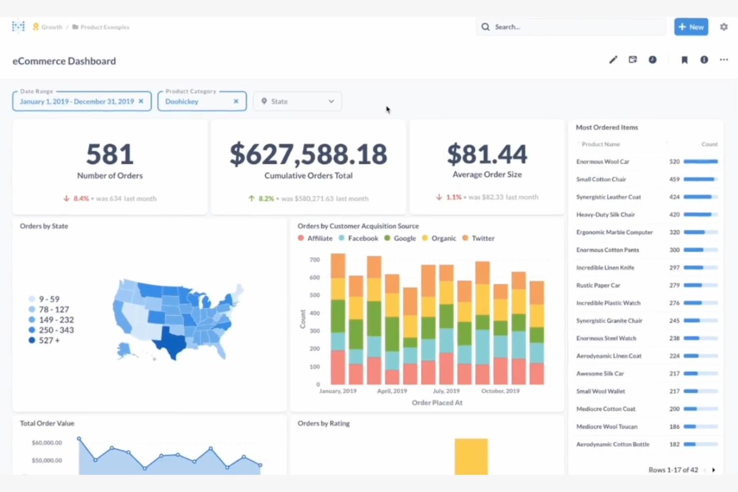
Metabase es una herramienta de inteligencia empresarial de código abierto que simplifica el análisis de datos para usuarios no técnicos. Es ideal para equipos que buscan explorar datos mediante visualizaciones intuitivas y paneles fáciles de usar.
Por qué Metabase es una buena alternativa a Tableau: Metabase ofrece analítica de código abierto, lo que proporciona a tu equipo la flexibilidad para personalizar y ampliar la plataforma según sea necesario. Puedes crear visualizaciones sin escribir consultas SQL, haciendo que la preparación de datos sea accesible para todos los miembros del equipo. El enfoque de la plataforma en la facilidad de uso garantiza que puedas configurarla rápidamente y comenzar a analizar datos. Su desarrollo impulsado por la comunidad significa que mejora y se actualiza continuamente.
Características e integraciones destacadas:
Las características incluyen una interfaz fácil de usar que te permite formular preguntas y obtener respuestas sin conocimientos técnicos. La plataforma admite consultas ad hoc, lo que te permite explorar datos sobre la marcha. También puedes programar informes para mantener a tu equipo informado con la información más reciente.
Las integraciones incluyen Amazon Redshift, Google Sheets, BigQuery, cargas de archivos CSV, Databricks y mucho más.
Pros and Cons
Pros:
- Autonomía en la implementación autohospedada
- No se necesita SQL para crear visualizaciones
- Admite consultas ad hoc
Cons:
- Profundidad básica en modelado estadístico
- Dependencia del soporte de la comunidad

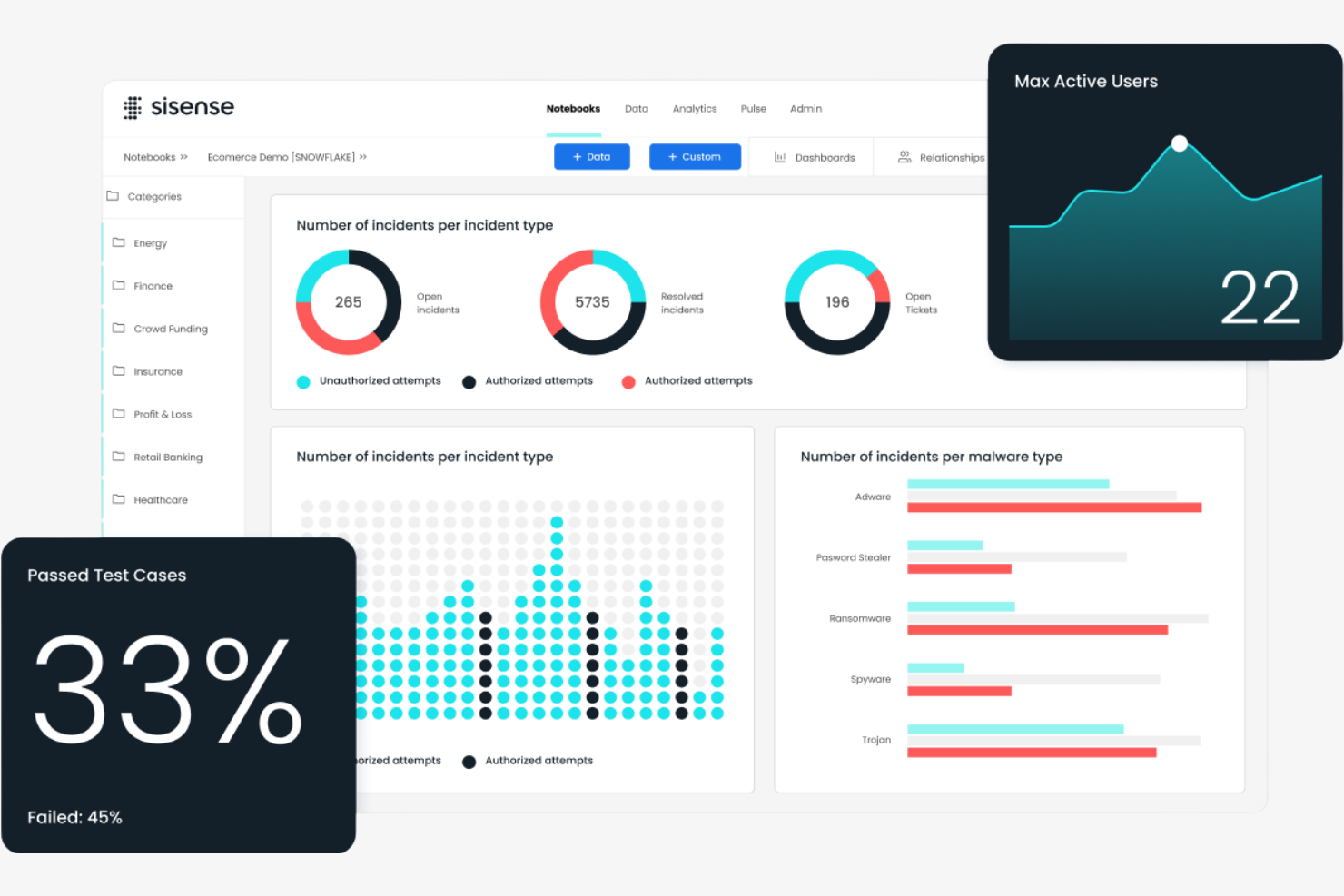
Sisense es una plataforma de inteligencia empresarial y análisis diseñada para profesionales de datos y usuarios empresariales. Te ayuda a ti y a tu equipo a analizar datos complejos y crear paneles interactivos para impulsar decisiones informadas.
Por qué Sisense es una buena alternativa a Tableau: Sisense ofrece soluciones personalizables, lo que te permite adaptar la plataforma a tus necesidades. Su tecnología dentro del chip acelera el procesamiento de datos y permite que tu equipo realice análisis más rápidos. Puedes integrar análisis directamente en tus aplicaciones, proporcionando información donde más se necesita. La plataforma también ofrece opciones de marca blanca, lo que te permite presentar la solución como propia.
Características e integraciones destacadas:
Las características incluyen una arquitectura de pila única que simplifica el análisis de datos. Puedes utilizar la función ElastiCube para almacenar y recuperar datos de forma eficiente. La plataforma también ofrece capacidades de aprendizaje automático, que te ayudan a descubrir información sobre tus datos.
Las integraciones incluyen Salesforce, Google BigQuery, Amazon Redshift, Snowflake, HubSpot y más.
Pros and Cons
Pros:
- Procesamiento de alta velocidad mediante tecnología dentro del chip
- Opciones de marca blanca
- Capacidades de aprendizaje automático
Cons:
- Configuración de ElastiCube con un alto consumo de recursos
- Se necesitan actualizaciones frecuentes

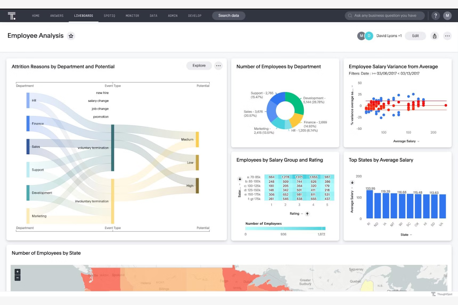
ThoughtSpot es una plataforma de análisis que permite a los usuarios empresariales buscar y evaluar los datos de la empresa. Está diseñada para equipos que necesitan obtener información rápidamente y visualizar datos para facilitar la toma de decisiones.
Por qué ThoughtSpot es una buena alternativa a Tableau: La información en tiempo real de ThoughtSpot mantiene a tu equipo al día y garantiza que las decisiones se basen en los datos más recientes. Puedes crear paneles interactivos que se actualizan al instante a medida que llegan nuevos datos.
Características e integraciones destacadas:
Las características incluyen un motor de procesamiento del lenguaje natural que te permite interactuar con tus datos usando el lenguaje cotidiano. Puedes aprovechar la información basada en inteligencia artificial para descubrir tendencias sin necesidad de amplios conocimientos técnicos. El motor de cálculo en memoria garantiza un procesamiento rápido de los datos para realizar análisis oportunos.
Las integraciones incluyen Google Sheets, GitHub, Salesforce y más.
Pros and Cons
Pros:
- Conectividad con almacenes de datos en la nube mediante consultas en vivo
- Rendimiento del motor de cálculo en memoria
- Accesibilidad para usuarios sin conocimientos técnicos
Cons:
- Modelado de datos previo obligatorio
- Necesidades intensivas de procesamiento de datos


Redash es una herramienta de código abierto para la visualización de datos y la creación de paneles, diseñada para equipos que necesitan consultar sus datos mediante SQL. Es ideal para analistas de datos y desarrolladores que buscan crear paneles interactivos y compartir información.
Por qué Redash es una buena alternativa a Tableau: Su simplicidad y enfoque en SQL la hacen accesible para usuarios técnicos que desean tener control directo sobre sus datos. Su naturaleza de código abierto permite la personalización y mejoras impulsadas por la comunidad.
Características e integraciones destacadas:
Las características incluyen un editor de consultas compatible con múltiples fuentes de datos y que permite escribir consultas SQL directamente. Las funciones colaborativas de la plataforma fomentan el trabajo en equipo, y puedes programar actualizaciones de consultas para mantener tus paneles al día.
Integraciones incluyen Google Analytics, Google Spreadsheets, JSON, Python, Salesforce, Yandex AppMetrica, Yandex Metrica y más.
Pros and Cons
Pros:
- Exploración directa de esquemas SQL
- Entorno de secuencias de comandos extensible basado en Python
- Conexión directa a fuentes de datos
Cons:
- Análisis avanzado limitado
- Opciones básicas de visualización

Sigma
Ideal para una interfaz de hoja de cálculo
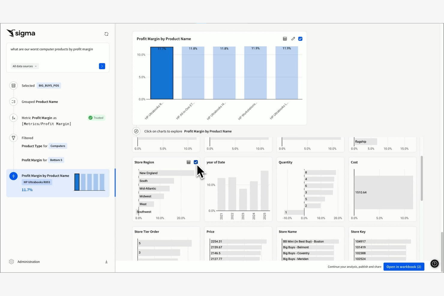
Sigma es una herramienta de inteligencia empresarial basada en la nube diseñada para usuarios empresariales familiarizados con las hojas de cálculo. Permite analizar y visualizar datos mediante una interfaz intuitiva similar a una hoja de cálculo.
Por qué Sigma es una buena alternativa a Tableau: Sigma ofrece una interfaz de estilo hoja de cálculo, lo que facilita que tu equipo pase de las hojas de cálculo tradicionales a una plataforma de análisis más potente. Su naturaleza basada en la nube garantiza que puedas acceder a tus datos desde cualquier lugar.
Características destacadas e integraciones:
Las características incluyen una funcionalidad de arrastrar y soltar que simplifica la manipulación y visualización de datos. Puedes utilizar sus herramientas de exploración de datos para analizar en profundidad grandes conjuntos de datos sin consultas complejas. La plataforma también ofrece funciones de colaboración en tiempo real para fomentar el trabajo en equipo.
Las integraciones incluyen Alation, AlloyDB, Atlan, Castor, Census, Databricks, Monte Carlo y más.
Pros and Cons
Pros:
- Interfaz similar a una hoja de cálculo
- No se necesita SQL
- Acceso basado en la nube
Cons:
- Dependencia de fuentes de datos exclusivamente en la nube
- Costos generales de la conexión directa al almacén de datos
Otras alternativas a Tableau
Aquí tienes algunas alternativas adicionales a Tableau que no llegaron a mi lista principal pero que aún así merecen atención:
- Strategy One
Ideal para paneles de ejecución de estrategias
- Amazon Quick Sight
Ideal para obtener información basada en IA
- BlazeSQL
Ideal para análisis basados en SQL


Cómo evalúo alternativas a Tableau
Ya sea que estés rastreando la adopción de funciones después del lanzamiento o creando tableros de KPI para ejecutivos, evalúo las alternativas a Tableau en dos niveles: el estándar mínimo que deben cumplir y lo que las diferencia.
Funcionalidad básica (requisitos indispensables para esta lista)
Cuando selecciono herramientas para mi lista, califico cada una en una escala del 0 (no ofrece la funcionalidad) al 5 (destaca en esta área) para cada funcionalidad básica que se menciona aquí abajo. Luego, calculo el puntaje total de la herramienta como un porcentaje. Cada herramienta necesita lograr un puntaje total mínimo de 75% para ser considerada para la inclusión.
- Visualización de datos interactiva: Evalúo la variedad de tipos de gráficos y controles de formato, desde gráficos de barras básicos hasta mapas geoespaciales y codificación de color condicional para desgloses por cohortes.
- Tableros interactivos: Los equipos de producto viven en los tableros, así que busco filtrado cruzado, rutas de profundización y parámetros dinámicos que permitan a los usuarios segmentar los datos por sí mismos.
- Conectividad a múltiples fuentes de datos: Reviso las bibliotecas de conectores nativos para asegurar cobertura de almacenes en la nube como Snowflake y BigQuery, además de aplicaciones SaaS como Salesforce y Mixpanel.
- Exploración de datos de autoservicio: Un PM que rastrea la adopción de funciones no debería necesitar SQL. Busco consultas de arrastrar y soltar, filtros ad hoc y búsqueda en lenguaje natural.
- Modelado y transformación de datos: Unir datos de uso de producto con registros de ingresos o CRM dentro de la plataforma es importante. Evalúo la lógica de unión, campos calculados y capas semánticas.
- Compartir, colaborar e incrustar: Considero cómo cada herramienta maneja el uso compartido basado en roles, informes programados para partes interesadas, comentarios e incrustación de tableros en portales internos.
Una vez tengo una lista de herramientas que cumplen con este criterio, considero qué diferencia a cada plataforma.
Factores diferenciadores (qué distingue a los proveedores)
Así es como comparo y contrasto diferentes proveedores:
Características sobresalientes
Las percepciones impulsadas por IA son importantes cuando los PM necesitan detectar caídas en la adopción entre miles de sesiones de usuario sin involucrar a un científico de datos. Las consultas en lenguaje natural complementan bien esto. Busco herramientas donde un PM pueda escribir «usuarios activos semanales por nivel de plan» y obtener una visualización de regreso. Las integraciones con plataformas de analítica de producto son otro diferenciador que evalúo de cerca. Los conectores nativos a herramientas como Amplitude o Mixpanel permiten que los equipos combinen datos de uso con métricas de negocio sin construir flujos personalizados. El flujo de datos en tiempo real completa esto para monitorear lanzamientos de funciones en vivo.
Más allá de las características
La estructura de precios es un factor importante. Evalúo si una herramienta ofrece asientos solo de visualización o niveles gratuitos, ya que los PM suelen compartir tableros con docenas de partes interesadas que no deberían necesitar cada uno una licencia paga. La integración con la pila de productos también importa. Verifico conexiones nativas con herramientas como Jira, Slack y Salesforce para que los insights lleguen a los flujos de trabajo donde se toman las decisiones. El tiempo hasta alcanzar el valor es otro factor que sopeso. Una plataforma con plantillas preconstruidas y una incorporación guiada permite que un PM construya tableros en días, no semanas de configuración.
¿Por qué buscar una alternativa a Tableau?
Aunque Tableau es una buena opción como software de inteligencia de negocios y visualización de datos, existen varias razones por las que algunos usuarios buscan soluciones alternativas. Puedes estar buscando una alternativa a Tableau porque…
- Necesitas opciones de precios más asequibles
- Tu equipo requiere capacidades de integración más sencillas
- Quieres una interfaz de usuario más simple para usuarios no técnicos
- Tu empresa necesita mejor accesibilidad móvil
- Requieres funciones adaptadas a sectores específicos
- Ves limitaciones con la escalabilidad de Tableau
Si alguna de estas situaciones te suena familiar, has llegado al lugar adecuado. Mi lista incluye varias opciones de programas de inteligencia de negocios y visualización de datos que se adaptan mejor a equipos que enfrentan estos retos con Tableau y buscan soluciones alternativas. Sin embargo, según el conocimiento general, aquí tienes algunas funciones comúnmente reconocidas de Tableau:
Características clave de Tableau
A continuación, se presentan algunas de las características clave de Tableau, para ayudarte a contrastar y comparar lo que ofrecen las soluciones alternativas:
- Visualización de datos: Crea una amplia variedad de paneles interactivos y compartibles.
- Análisis en tiempo real: Analiza los datos a medida que llegan, manteniendo tus conocimientos actualizados.
- Mezcla de datos: Combina datos de diferentes fuentes en una sola vista unificada.
- Interfaz de arrastrar y soltar: Elabora informes sin necesidad de conocimientos técnicos.
- Análisis geoespacial: Visualiza datos geográficos usando capacidades de mapeo.
- Compartir y colaborar: Comparte paneles y colabora en los conocimientos con tu equipo.
- Soporte móvil: Accede a paneles e informes desde dispositivos móviles.
- Paneles personalizables: Adapta los paneles para ajustarlos a las necesidades específicas de tu negocio.
- Cálculos avanzados: Usa herramientas para realizar análisis y cálculos complejos de datos.
- Conectores de datos: Integra con diversas fuentes de datos para facilitar el acceso a la información.
¿Qué sigue?
Si estás en proceso de investigar software de inteligencia de negocios y visualización de datos, conéctate con un asesor de SoftwareSelect para recibir recomendaciones gratuitas.
Solo tienes que completar un formulario y tener una breve charla donde analizarán los detalles específicos de tus necesidades. Luego recibirás una lista breve de software para revisar. Incluso te acompañarán durante todo el proceso de compra, incluyendo la negociación de precios.